Why this matters
CloudZero Explorer answers a cost question in two parts. The chart shows what your spend did and the table underneath shows which service, account, or team did it. Until now, the chart pushed the table below the fold, and actions like creating a View or checking Anomalies were buried multiple clicks deep.
Now the chart and table share the screen and a new right rail puts Favorites, Views, Anomalies and Insights one click away without covering your data. You spot the spike, read the row behind it, and save what you found, all without having to scroll or navigate away.
What we built
A shorter chart pulls the results table up so both are visible at the same time. Usage and Unit controls now sit inside the chart area with the data they change. “View Usage” is now just “Usage.”
A new icon rail on the right edge of Explorer holds four items: Favorites (your query history), Views, Anomalies, and Insights. Only icons are visible by default, but hover over one to see its label. Click to open the full panel, which pushes your data over instead of covering it. The rail also collapses to a small peek tab when you want the full width for your data.
The application background is now ice blue. Charts, tables, filter panels, and cards stay white, giving each one a clean edge
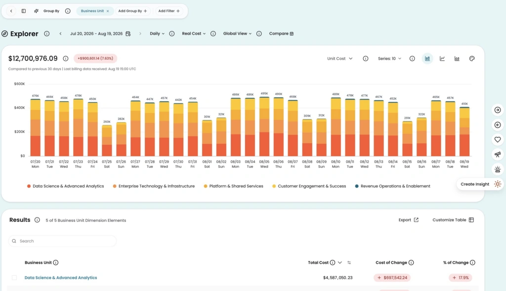
Image: The chart and results table visible together on the new blue background, with the right rail’s icon labels a hover away.
How it works
There is nothing to turn on. The new sizing, the right rail, and the background are live for all customers now.
This is the first batch of a larger set of design updates that will ship incrementally over the coming weeks.
Open Explorer → https://app.cloudzero.com/explorer