Why this matters
Months have different numbers of days, and a monthly cost chart built on raw totals mixes that calendar difference into the trend. A 28-day February next to a 31-day March shows a 10.7% increase even when daily spend never moved. The same math works in reverse: real growth in a short month can look flat, hiding an increase worth investigating.
That costs you time in two places. The first is triage. You open Explorer, see the jump, and spend time working out whether it was a team or the calendar that changed something. The second is the conversation after triage. Finance recognizes the invoice number and nothing else, so a normalized figure you can’t tie back to the bill raises more questions than it answers.
You now get both readings in one chart. The bars represent the billed amount and the dashed line is the day-count-corrected trend. The gap between them is the calendar. When you check whether a rightsizing project or a new commitment actually reduced cost, the dashed line tells you whether behavior changed and the bars tell you what you paid. Share the link with an engineering lead or drop it in a ticket and they see the same chart you did.
What we built
A new Normalized trend button in Explorer. It appears in the chart controls row whenever you set granularity to Monthly on a cost metric.
When you turn it on, the bars stay at actual billed cost and a dashed line overlays them, plotting each month’s 30-day-normalized value (each month’s cost / its day count x 30). Hover on any bar and the tooltip shows the actual cost and the 30-day equivalent side by side for every series in the chart, plus a normalized total, so in a grouped view tells you which service or team actually moved and which one only looks like it did. The setting is stored in the URL, so it survives a refresh and travels with the link when you share the view.
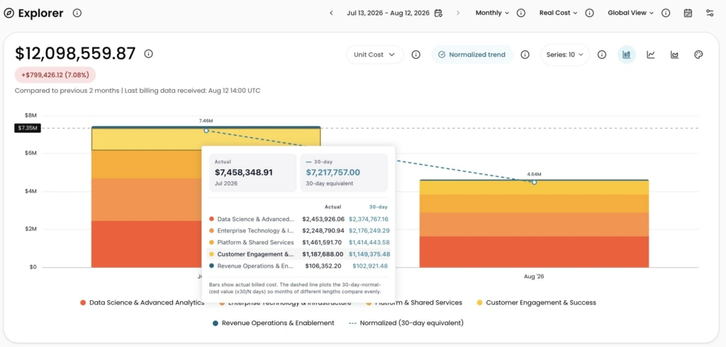
Image: Bars show actual billed cost by team while the dashed line plots the 30-day-normalized trend. The tooltip displays both values side by side for every series, so you can see exactly where the calendar created the gap.
How it works
In Explorer, set granularity to Monthly, then click Normalized trend in the chart controls row. Turn it off to return to bars only.