Why this matters
When spend moves, the first question is always “compared to what?” Answering it used to mean pulling up two tabs with two different date ranges and toggling between them, or squinting at a single delta number without the ability to customize what you’re comparing against. Compare Periods puts both periods in front of you at once, so a spike, a regression, or a shift shows up on the chart and in the cost table, without you doing the math yourself.
Comparing cost across time is a common ask from customers managing multi-team or multi-account spend, and it’s now a native, shareable part of Explorer.
What we built
Compare Periods is now generally available in Explorer. Pick any previous period and CloudZero shows the difference visually on the chart and numerically in the cost table.
You get two ways to view it. Aligned view shows side-by-side bars for each interval; switch to a line chart and the compared period renders as a line while the current period stays as stacked bars. Overlay view that plots both periods as lines on the same chart with the current period solid and the compared period dotted.
The cost table shows Base Cost, Compared Cost, Cost Difference (color-coded), and % of Change. Quick Picks cover the common comparison ranges (previous period, week, month, quarter, or year ago), and custom date selection handles the rest. Comparison settings save to the URL, so sharing a link opens the exact same comparison for anyone on your team.
How it works
In Explorer, click the Compare Periods icon (the calendar) at the top right to open the panel. It defaults to the previous period in Aligned view, and the chart, cost table, and summary above the chart update immediately. Switch to a different Quick Pick, a custom range, or a different view like Overlay, and everything updates again right away.
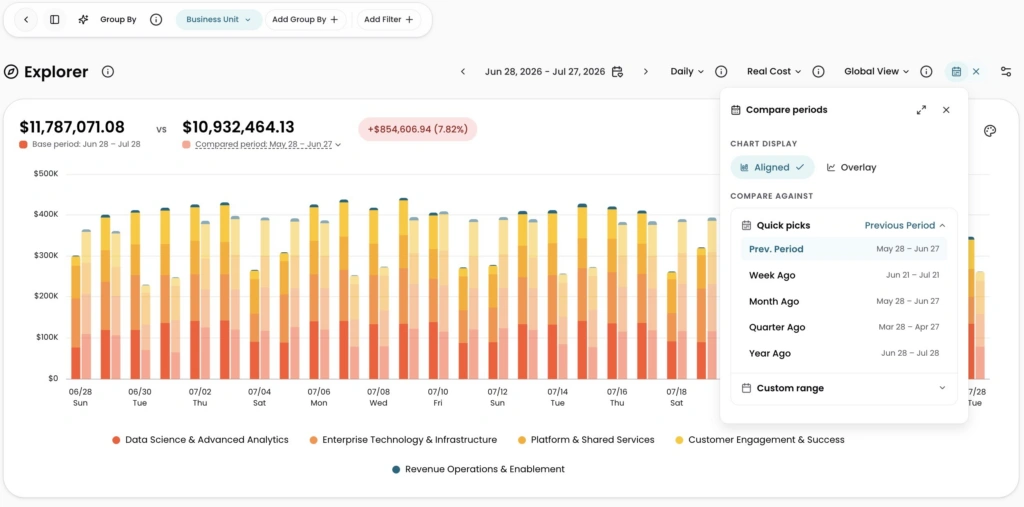
Image: Compare Periods Aligned view in Explorer, comparing Jun 28-Jul 28 against the prior period day by day, with the total cost difference called out above the chart.