Why this matters
Finance teams reconcile cloud spend period by period. They want each month, week, or day in its own column, so they can scan across a row and see how a service or team changed over time.
Explorer’s Aggregate view already answers “what changed and by how much.” But when the question is “what did we spend in June, July, and August, line by line,” that summary needs to become a grid. It’s the same period-by-period layout you see in AWS Cost Explorer, and one of the most-requested views from our customers. Until now, getting there in CloudZero meant exporting to a spreadsheet and pivoting the data by hand, every month.
What we built
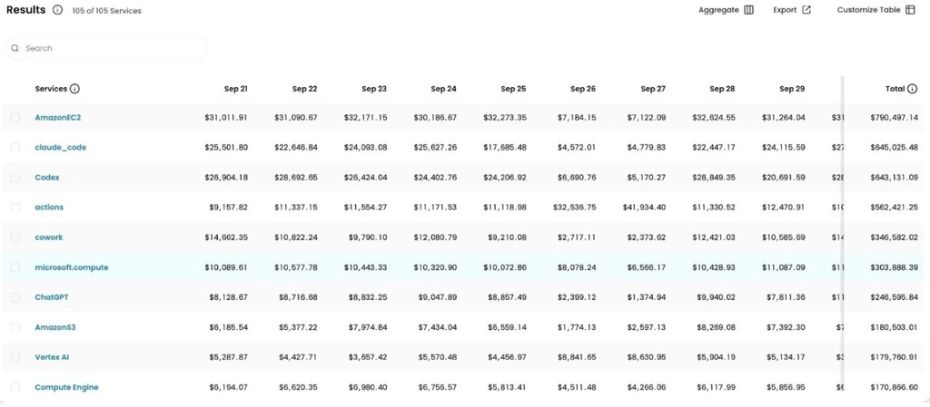
Image: Explorer’s Date layout showing daily costs by service.
The Date layout in Explorer is now generally available. The results table has two layouts you can switch between. Aggregate shows Total Cost, Cost of Change, and % of Change for the full time range. Date breaks those costs into one column per period, hourly, daily, weekly, or monthly, based on the granularity you’ve set, plus a Total column.
Your group-by dimension stays pinned in the first column as you scroll across periods.When you right-click to copy a value, CloudZero copies the raw number, so it pastes into a spreadsheet as a number you can sum. The layout you choose is saved in the URL, so a shared link or saved favorite reopens in the same view. And when you export, the CSV matches the grid: same periods, same shape.
How it works
Switch between Aggregate and Date in the results table toolbar. The Date layout is available when you group by a single dimension. Choose your granularity and each period becomes its own column.
See it in the docs → https://docs.cloudzero.com/docs/grouping-filtering-and-time-range#switch-between-aggregate-and-date-layouts