Why this matters
The controls at the top of Explorer are great for a simple question. But as your query grows with more group-bys or a stack of filters, those controls start eating into the vertical space you actually want for your data. Now you have the option to move filters and groupings into a dedicated left side panel, so a complex query has room to scale cleanly. Set it once and CloudZero keeps it that way.
What we built
Filters and groupings now have an optional home on the left side of Explorer. Group By and filters each get their own labeled section, so the two are easy to tell apart at a glance, with Apply and Clear all right at the top. The controls at the top of Explorer stay the default, and the side panel is there for when you’d benefit from extra room.
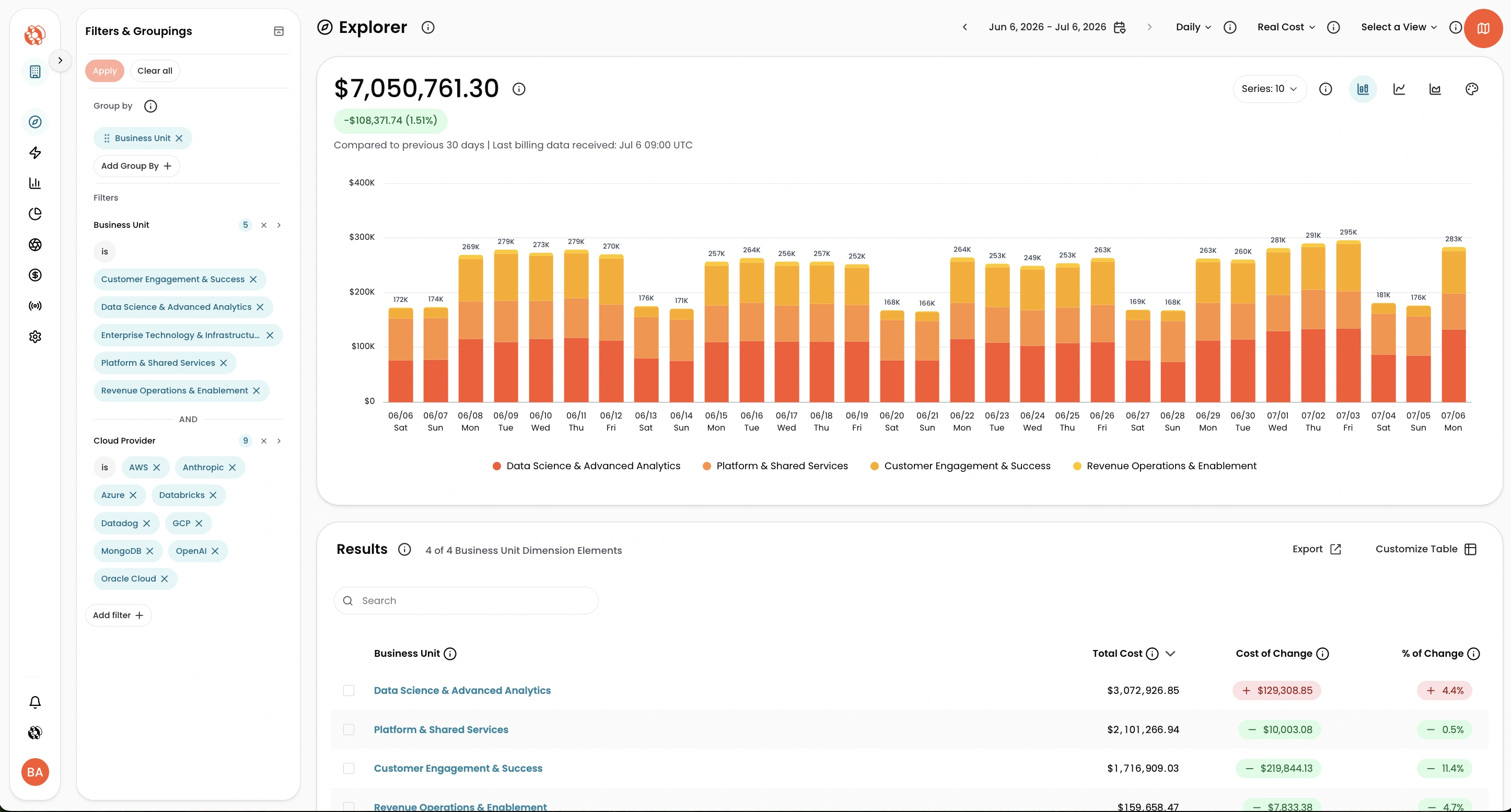
The Filters & Groupings side panel keeps even a dense query fully in view. Here, two group-bys (Service and Account) plus a 12-account filter sit in their own labeled sections on the left, while the full chart and results stay visible on the right.
How it works
Filters and groupings now have an optional home on the left side of Explorer. To move them in, click the side panel icon next to the back arrow. To bring them back to the top, click the collapse icon at the top of the panel. CloudZero remembers your choice across sessions, so the layout stays the way you set it.