It’s not news anymore. More businesses are collecting a lot more data than they can handle. One out of ten respondents to surveys by IDC, Seagate, and Matillion said they were finding it hard to transform their data into an analytics-ready format.
This does not have to be you.
This snackable guide explains how modern business intelligence can help you make the most of your data. We’ll also include some of the best BI tools available today, from predictive analytics to cloud cost intelligence platforms.
What Is Business Intelligence And Why Is It Important?
Business Intelligence (BI) is a technology-enabled process that collects, stores, processes, and parses business data to inform business decisions. BI involves data mining, process analysis, performance benchmarking, and descriptive analytics.
BI tools collect, store, and analyze company data, presenting reports, performance measures, and trends. These tools include spreadsheets, reporting/query software, data visualization software, data mining tools, and online analytical processing (OLAP).
The goal of BI is to improve the quality, timeliness, and depth of data available for analysis to enable smarter decisions. Ultimately, BI helps companies improve efficiency, profitability, competitiveness, and operational excellence.
In theory, this sounds very straightforward, but in practice, it can be quite a handful. And this is where using a robust BI tool can be extremely helpful.
Report
Finance needs to prove AI’s return: CloudZero report
260 senior finance leaders (more than half CFOs) told us why the speed of seeing AI spend, not the size of it, separates who pulls ahead on AI from who gets burned.
Why Use a BI Tool?
Some of the key advantages of using BI tools include:
- Simple Excel spreadsheets and SQL-based databases can no longer handle the complexity and unwieldiness of today’s data.
- Almost every company produces a great deal of data these days. BI tools can help organize, analyze, and interpret this information in the context of your business.
- From streaming data to social media content, BI tools aggregate data from multiple sources simultaneously.
- Companies can also identify patterns and trends in the data without too many processes, so they can respond to changes in the market accordingly.
- Further, BI tools provide companies with an integrated dashboard and allow them to quickly and accurately share insights across departments.
Overall, business intelligence platforms can help you build a competitive edge by providing insights into customer behavior and trends. In turn, you can improve your products and services accordingly.
What Makes A Great BI Tool?
The most effective Business Intelligence (BI) tools have several capabilities in common, all of which you’ll want in yours:
- Ease of use: You’ll want a user-friendly interface and intuitive features to encourage adoption and shorten the learning curve.
- Scalability: Ensure the tool can handle your existing data volume and scale as your business grows. You want it to handle large datasets without crashing.
- Supports a variety of integrations: Seamless integration with your existing data stack and sources, such as databases, CRM systems, and cloud platforms is crucial.
- Data security: Find out what data security features the tool provides. If you need to share data with distributed teams, for example, does it promote remote access with Identify and Access Management (IAM)? Keep in mind that a single data breach can cost $4.5 million to resolve, according to IBM.
- Customization and extensibility: Choose a tool you can customize to fit your organization’s dynamic needs. For example, an excellent enterprise BI platform enables different teams to organize their data however makes sense for them.
- Robust support and training: This can be the difference between making the most of the BI tool and being stuck without ROI. A great tool will provide a variety of resources to help you get started, from tutorials to in-person training.
- Data visualization: The platform should provide a single source of truth for your business data, as well as allow you to see how different aspects of your business fit together. Interactive data visuals promote understanding.
- AI-driven search capabilities: AI-driven, natural language searches foster quick insight discoveries. In addition, AI can rapidly identify patterns that would take a human team some time to recognize.
- Advanced analytics: Think of capabilities such as real-time analysis, predictive modeling, and machine learning algorithms.
- Collaboration tools: These include shared dashboards and reports, as well as permission settings for data access and editing.
- Cost-effective: Ultimately, you want a tool that offers a transparent, reasonable pricing structure — one that won’t eat into your margins.
In the next section, we’ll look at some of the best business intelligence software for each function.
Reporting And Data Visualization
Data visualization involves presenting data in a graphical or visual format, such as charts, graphs, or 3D models. This can help your stakeholders understand complex information more easily. Reporting, on the other hand, refers to the process of generating and sharing data insights in a structured format, such as reports or dashboards. The following BI platforms can help.
1. Sisense
Sisense enables you to expose crucial business insights from large complicated pools of data. Sisense gives you full control of how and when reports are generated and distributed. Sisense features fully interactive reports that populate their fields from dynamic real-time data.
In addition to their advanced reporting tools, Sisense also features KPI dashboards, multiple device and platform support, and end-to-end reporting.
2. SAS Viya
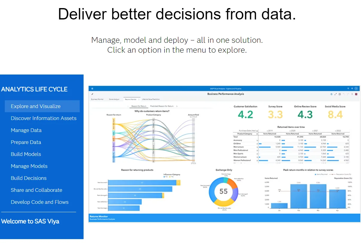
SAS Viya helps you import data from sources like databases, Hadoop, Excel spreadsheets, and social media. You can then easily manipulate and prepare the data using functions like change case, convert, rename, and create calculated columns.
The BI platform also enables drillable hierarchies and self-service hierarchies without predefined user paths. This is great for data exploration and analysis. SAS Viya also provides interactive tools for discovering relationships, trends, and outliers more efficiently.
In addition, your team can easily collaborate and use a wide range of graph objects and charts for data visualizations. They can customize layouts, add web content and images to reports, and more for seamless analysis.
3. Dundas BI
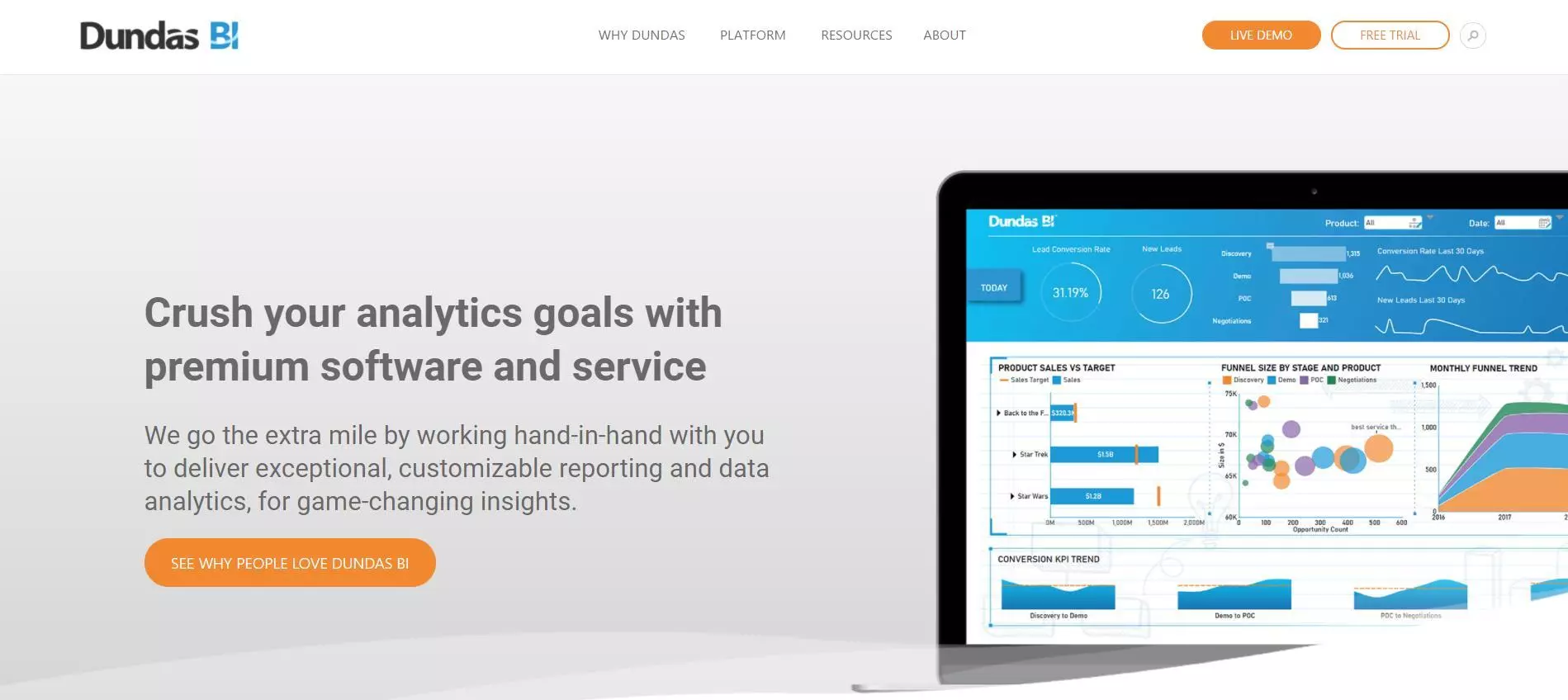
As a company, Dundas has been around since 1987. This makes them one of the oldest companies to specialize in data visualization — at least on this list. As with most modern BI vendors, they’ve moved away from desktop computer software to SaaS cloud-based reporting.
Much like SAS Visual Analytics, Dundas BI uses simple and clean designs for its reports. Additionally, they use dynamic widgets, icons, and controls to represent dynamic and changing data. Where Dundas outperforms most of its competitors is in support. They will actively guide you through the report building and generation process.
4. Oracle BI
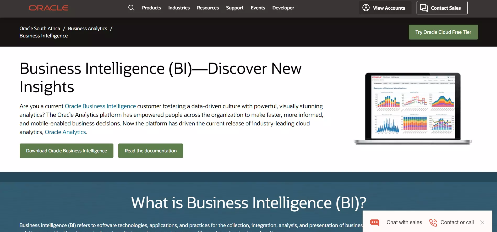
Oracle’s Business Intellect Suite was developed and released in 2013. Since then, they’ve managed to refine and polish their reporting and analytics tools. Oracle BI’s software focuses heavily on user independence and self-service. However, it also supports governed and centralized models too.
Oracle BI provides organizations with a report-building toolkit replete with a variety of visual elements to help make sense of vast amounts of data.
As with Oracle’s many other products, it also provides software developers with API access so you can integrate Oracle BI into your company’s software products. Oracle is an industry-leading brand and it’s hard to go wrong with any of their products.
5. SAP Business Objects
SAP is another highly esteemed company with years of experience to back up its reputation. SAP Business Objects is their highly scalable business intelligence suite. It features flexible licensing with a heavy emphasis on self-service.
The service can be deployed on-premise or via the cloud. In addition to its rich reporting tools, it features:
- Embedded analytics
- Large-scale data analysis
- Customizable dashboards
- Cross enterprise sharing
- Microsoft Office integration
Again, SAP has proven to be a leader in business software, successfully catering to some of the largest companies such as Vodafone, Allbirds, and the Mercedes-EQ Formula E team.
6. Tableau
You cannot compile a list of the best BI tools without including Tableau. In fact, thanks to its highly advanced reporting and visualization features, it is one of the most popular entries on this list. Tableau is primarily made for mid-size to large enterprises.
It allows companies to distill information from raw data and translate it into easy-to-understand charts, graphs, and reports. Where Tableau may lose its appeal for many people is in its price tag.
Tableau Creator costs $70 per user (per month). This can be steep for organizations that require 50-100 licenses. However, Tableau’s reputation suggests that the cost is well worth it.
7. Domo BI & Analytics
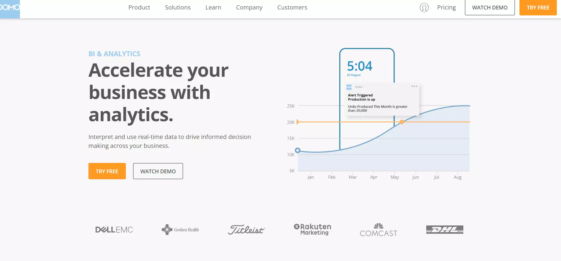
Domo hasn’t existed as long as companies such as SAP but its simplicity and collection of features make it a credible contender. It allows you to collect and unify data from your silos and visualize it all in a way that’s meaningful to your organization.
What makes Domo unique is its data storytelling feature. It provides report builders with a wide variety of visual elements to map data and make it more substantive.
Domo features thousands of icons, widgets, custom maps, and at least 150 different chart types. And of course, Domo regularly updates its toolsets. Domo makes generating reports an enjoyable and breezy experience.
8. Metabase
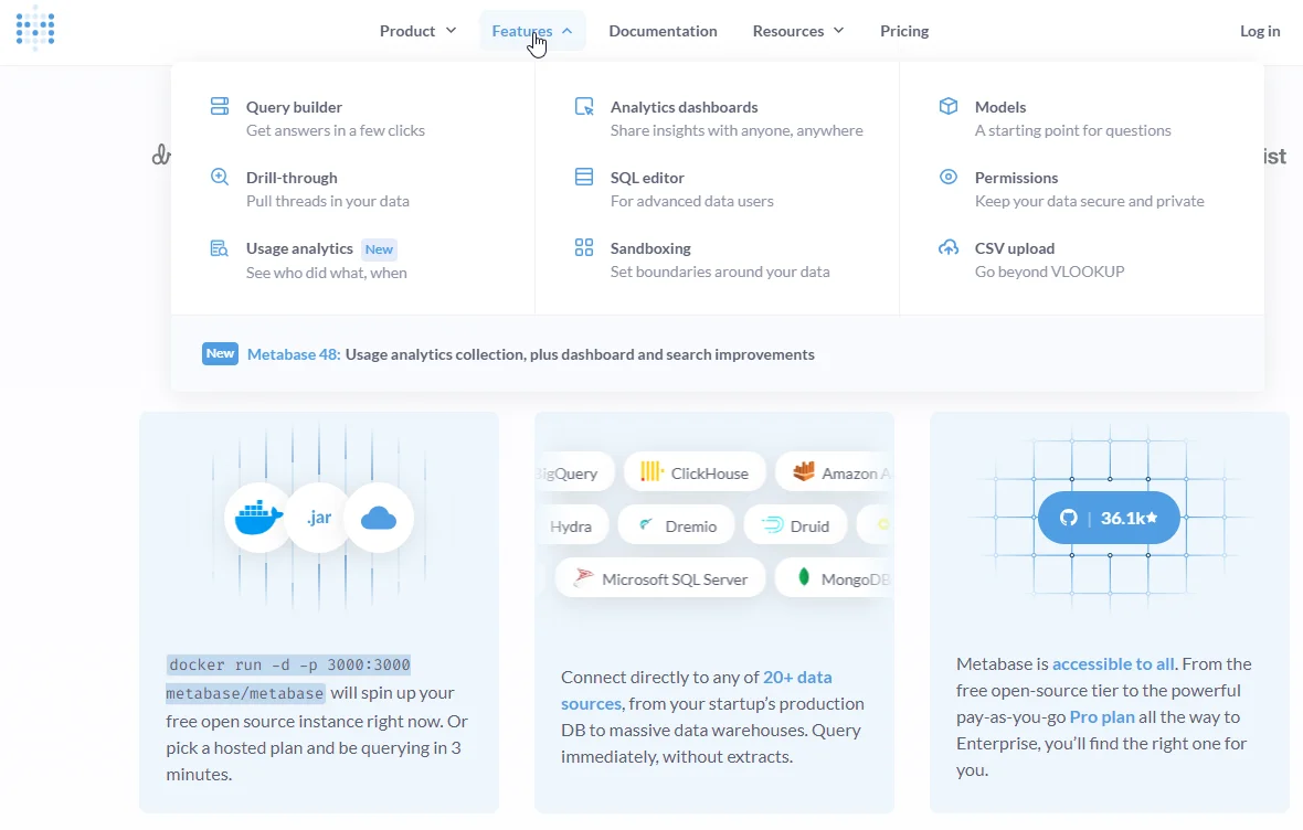
Metabase provides an open-source business intelligence tool that is user-friendly. Metabase allows users to ask questions and receive answers in the form of simple visualizations or complex reports. It supports a variety of data sources, from more traditional databases like MySQL and PostgreSQL to more modern solutions such as Google Analytics and MongoDB.
It empowers users to create queries without needing to know much SQL. Meanwhile, it offers SQL support for more advanced users. Metabase dashboards and reports are easily customizable, ensuring teams can make the solution their own and adapt it to their unique BI needs.
Additionally, Metabase promotes collaboration with features for sharing insights and data-driven stories across your organization. This balance of simplicity, power, and collaboration makes Metabase a valuable tool for businesses looking to leverage their data for insights.
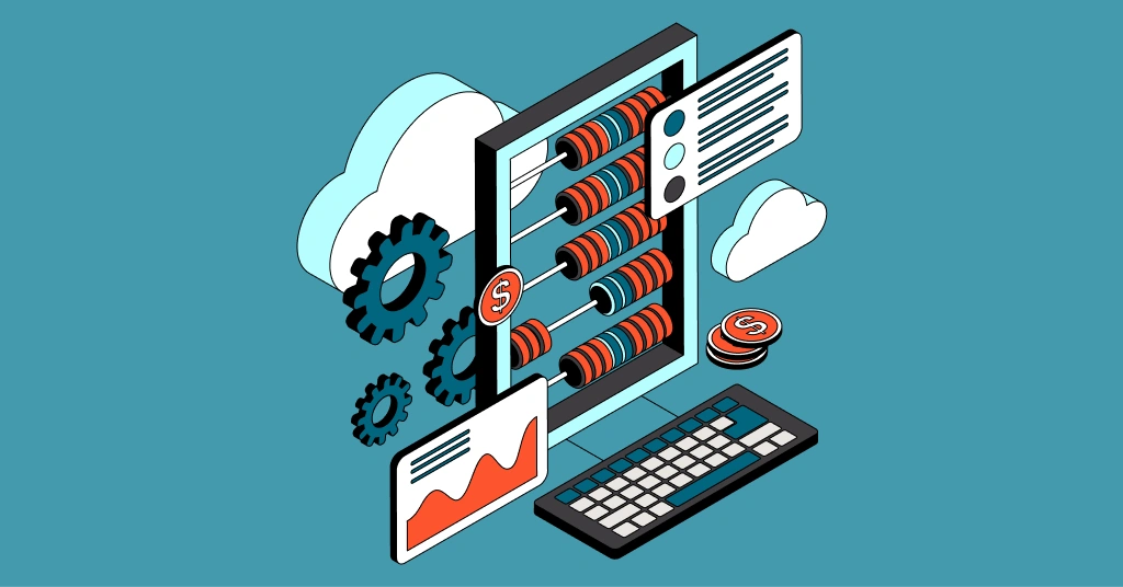
Cost Management & Optimization
Running a modern business involves many cost uncertainties. By testing scenarios based on data and business intelligence, you can better predict future costs. You need to know how much it costs to support specific customers so you can price your services in a way that is both competitive and profitable.
Consider the following cost management and optimization platforms.
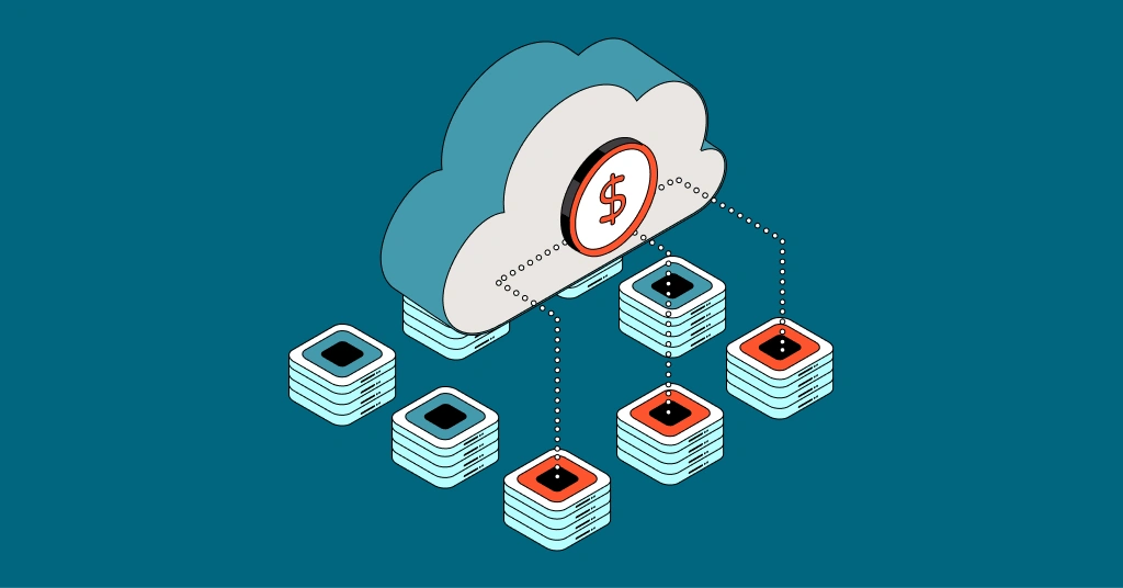
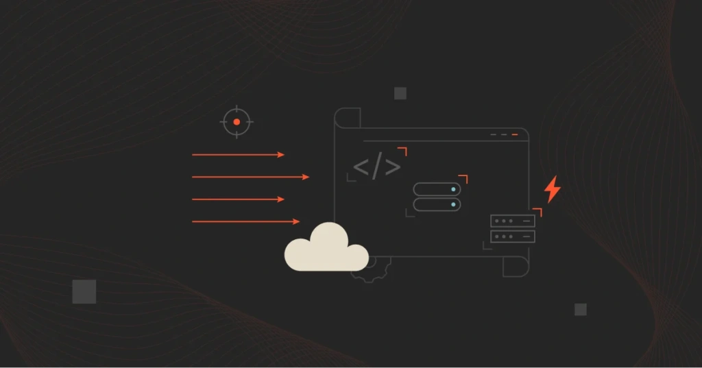
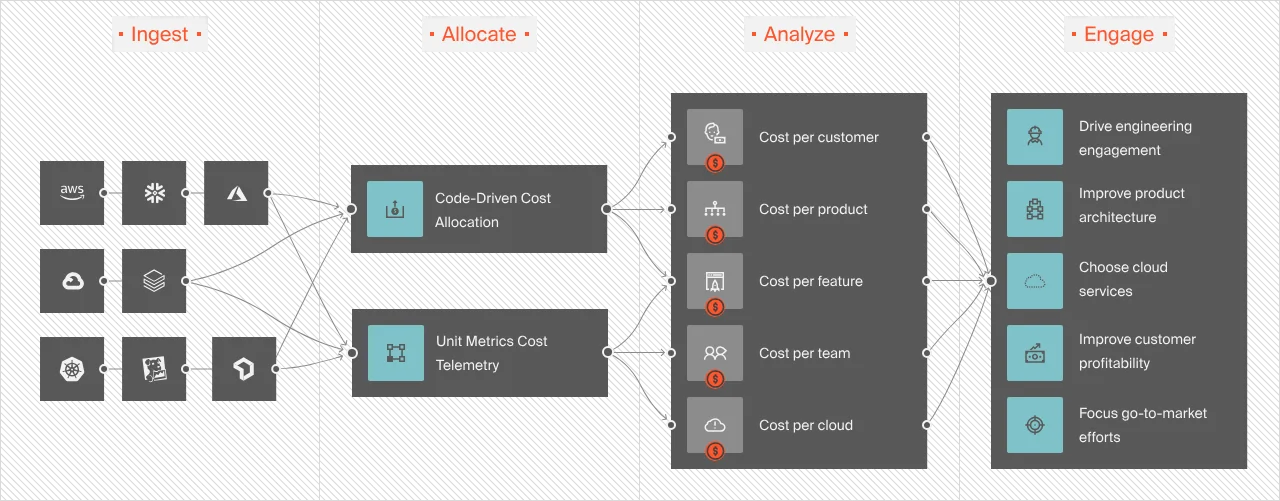
9. CloudZero
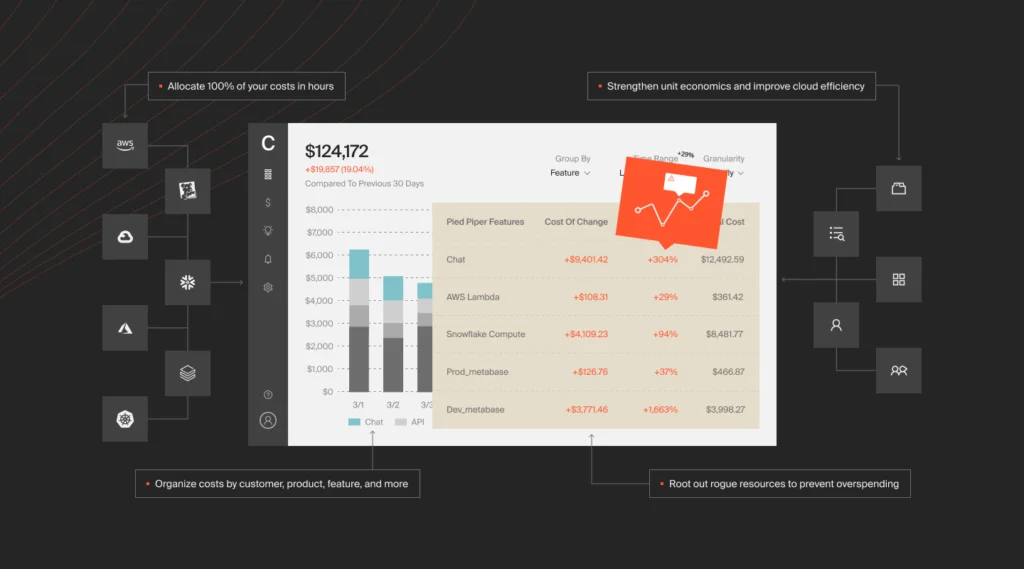
CloudZero is a cloud cost intelligence platform that aligns cloud spend to the business metrics you care about. CloudZero uses a code-driven approach to organizing cloud spend, eliminating the need for weeks and months of painful tagging.
CloudZero lets you see exactly how costs relate to business outcomes, not just how much you spend each month. With CloudZero, you can:
- View your costs in a single source of truth. CloudZero delivers robust cloud cost intelligence across clouds (AWS, Azure, GCP, Oracle Cloud) and platforms (Snowflake, Databricks, MongoDB, Datadog, New Relic, and more), as well as containerized environments (Kubernetes).
- Get granular insights into your cloud costs, such as Cost per Customer, Cost per Feature, Cost per Team, and Cost per Project. Only CloudZero offers this level of cost intelligence across all cost dimensions.
- Organize your spending in any way that makes the most sense to you with custom cost dimensions.
- Help engineering and finance align by tracking costs in a common language, such as Cost per Service, Cost per Environment, and Cost per Deployment.
- Unlike most cost tools that have trouble accounting for shared costs, CloudZero allocates 100% of your costs regardless of how complex your environment is, including multi-tenant environments.
- CloudZero captures, normalizes, and enriches your cost data, enabling you to track tagged, untagged, and untaggable costs without perfect tags.
Drift, Remitly, New Relic, MalwareBytes, and Obsidian are among the ambitious brands using CloudZero to slash costs, cut management time, and surface new revenue streams. See the customer success stories here. Or, get a free product tour of CloudZero here. Better yet, get a free, personalized demo of CloudZero here or experience it for yourself.
10. Harvest
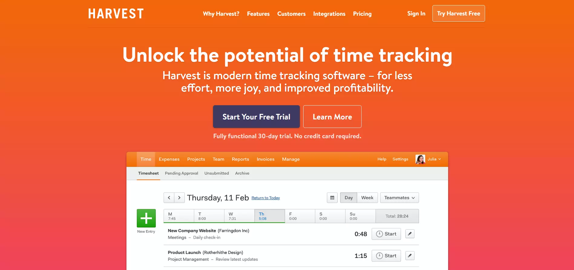
Harvest is advertised and marketed as a time-tracking solution for businesses. However, under the hood, it can be used as a powerful cost-tracking solution too.
Harvest’s timesheets can help you track and compare employee work hours. This is particularly useful for companies with a hybrid, remote, or mobile workforce.
You can use data gathered from Harvest to analyze how productive employees are and how they impact company costs. Furthermore, you can also use Harvest to manage and assess project costs.
11. Avaza
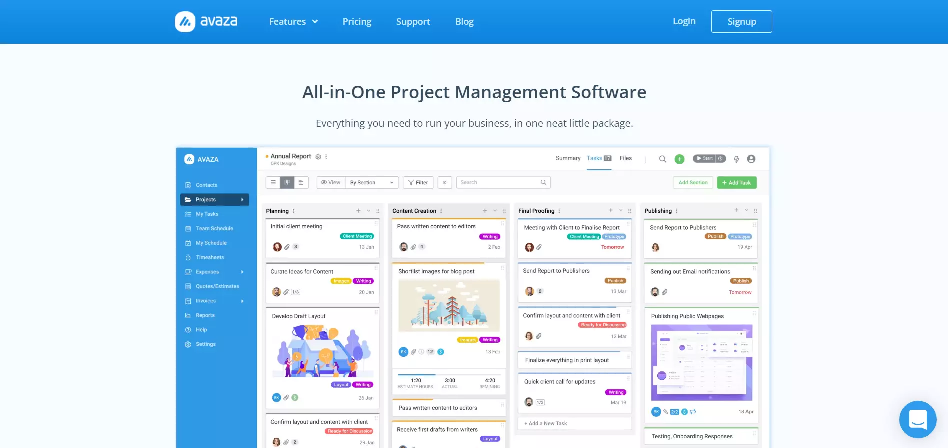
Avaza is an extensive project management solution. It allows you to schedule resources, track expenses, invoice costs, create timesheets and manage employee tasks.
Since it’s a cloud-based software suite, Avaza can be accessed from nearly every internet-enabled device. Avaza’s user interface is nearly uniform on all platforms.
It’s cleanly designed, well organized, and easy to use. Additionally, Avaza has a slew of affordable packages. It’s a great all-in-one solution for companies looking to track expenses while managing resources.
12. AWS Budgets
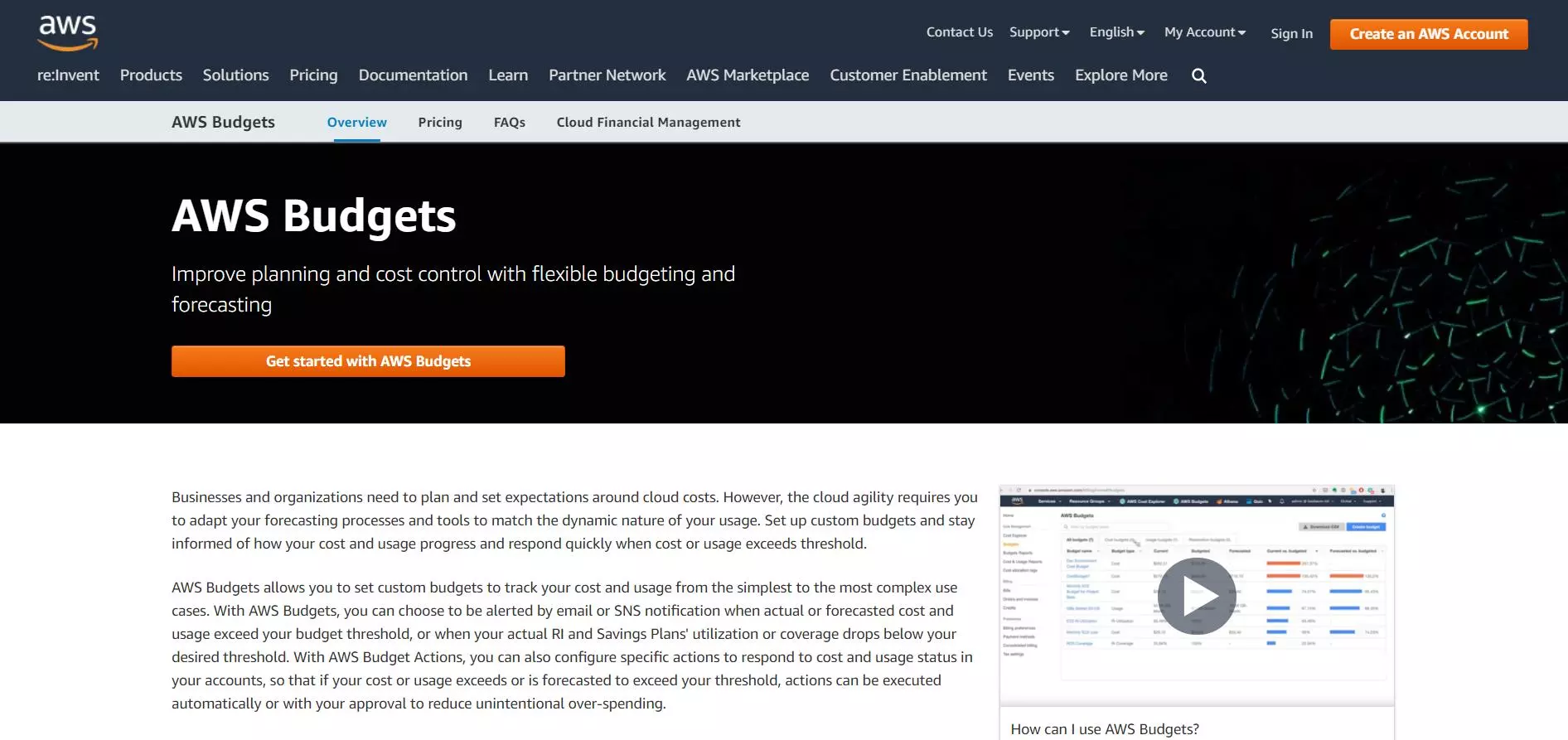
AWS Budgets is a service that helps you plan service usage, service costs, and instance reservations. AWS Budgets notifies and alarms you when you go over budget. Users can create up to 20, 000 budgets. The first two budgets are free.
AWS Budgets lets you to set up alerts that will trigger if you exceed or approach your defined budget.
There are three types of budgets you can create. They include cost, usage, and reservation. While AWS Budgets don’t provide you with some of the same automation that other tools in this guide do, it’s affordable and empowers you with full control over your costs.
13. GCP Billing
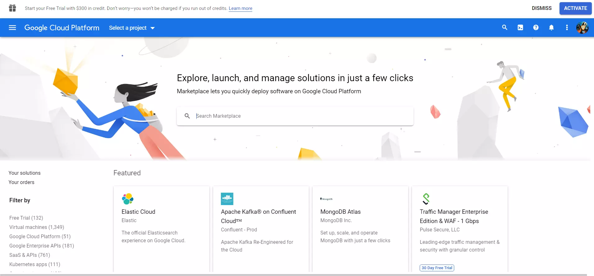
GCP Billing is Google’s built-in cost management tool, primarily made for their cloud products. You get a top-level view of how your cloud spending is segmented. It offers tools such as regular reporting, budgeting alerts, spending analysis and tips on how to prevent overspending.
Additionally, Google provides you with its API. This allows you to integrate it into your other BI tools (at least the ones that support it).
14. Azure Cloud Cost Management
Azure Cloud Cost Management is a native Azure service that allows customers and partners to gain complete visibility and control of their cloud spend across Azure and AWS.
It is primarily designed for managers, finance users and app teams. Azure Cloud Cost Management facilitates a continuous iterative process between these three personas.
You can essentially track where charges originate from and how they relate to your invoice. It also allows you to break down and analyze that data.
15. Power BI
Power BI is a fully-fledged BI solution provided to you by Microsoft. It’s an interactive reporting platform that provides you with powerful tools for data and business analytics.
You can use Power BI to create stunning reports, allowing you to easily visualize and showcase important cost data. Power BI allows you to pull data from a multitude of sources such as SAP, Oracle, data warehouse, offline documents, etc. Again, Power BI is an all-rounder that goes beyond cost analysis.
16. MicroStrategy
Microstrategy is an open enterprise data analytics platform designed to enrich websites and applications with business intelligence. It allows you to protect your data from being siloed while ensuring its integrity.
Microstrategy connects every user and every application to all your data. It enables you to visualize cost and data through its unique semantic graph.
This helps you visualize how data flows from and through your business. It can be quickly created and re-used which will allow you to accelerate the collaboration and development of your suite of BI applications.
Dashboards
Dashboards are another way to access important analytics from your pool of data without generating reports in file form. For instance, if you’re trying to obtain crucial information such as key performance indicators (KPI), your dashboard BI solution can easily make it available in real-time.
Most dashboard BI solutions have highly customizable but intuitive user interfaces. They allow you to specify the number of panes, widgets, sources, etc. You can present data in the form of dynamic and static lists, tables, and charts. This section will cover some of the best BI dashboard tools.
17. Geckoboard
Geckoboard was initially set up to cater to small-to-medium-sized companies. Today it supplies its software to some of the biggest organizations in the world. It allows you to construct dashboards to visualize shifting data in real-time.
Data and metrics such as KPI can be transformed into trade screen-like dashboards. Your entire team can view these dashboards in real-time so everyone stays on top of things.
Geckoboard provides access to over 60 different data sources. You can integrate elements from external data sources such as social media. For instance, you can track and view Facebook usage data in real-time.
18. Cyfe
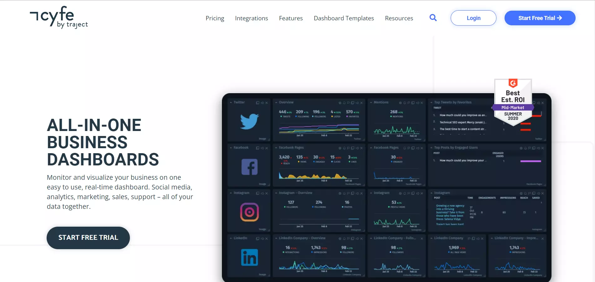
Cyfe is a great alternative all-in-one cloud-based BI solution for creating dynamic dashboards and screens. Its user interface is intuitive and easy to master. However, it does sacrifice customizability for simplicity. This shouldn’t be a problem for most users.
Cyfe provides support through an email help desk, voice calls, forums, a knowledge base, and a live chat. Additionally, Cyfe supplies training material through webinars, documentation, and videos. Cyfe is one of the straightforward and easy-to-use BI tools on this list.
19. Databox
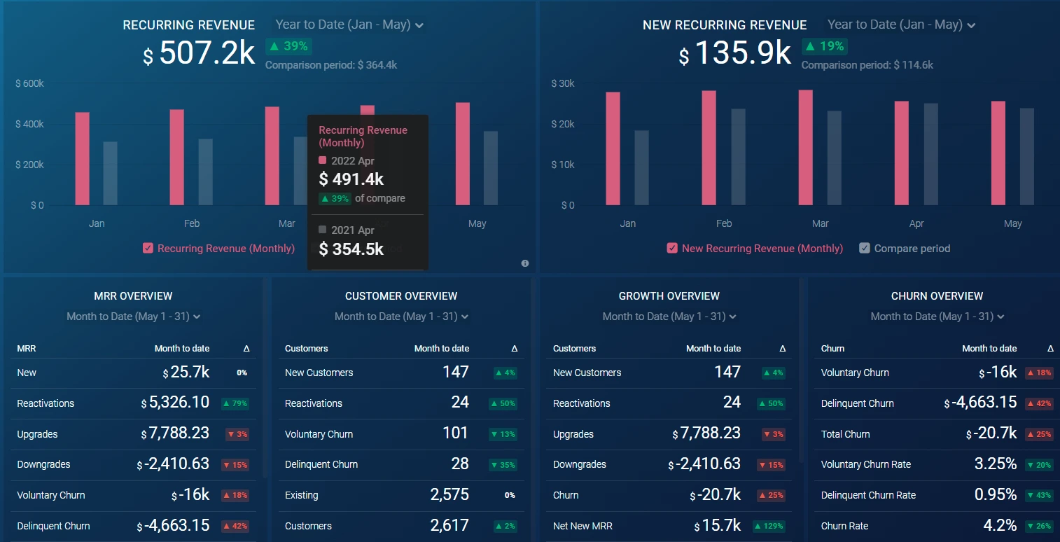
Databox has one of the best-looking dashboards on this list. Its dashboard customization screen is clean and easy to use. Not only can you visualize internal data with Databox but it also facilitates integration with over 70 different external sources. From Shopify to PayPal. Outside of simple dashboard creation, some of Databox’s most notable features also include:
- TV dashboards
- Goals
- Scorecards
- Calculated metrics
- Looped data boards
- Real-time notifications and alarms
20. Datadog
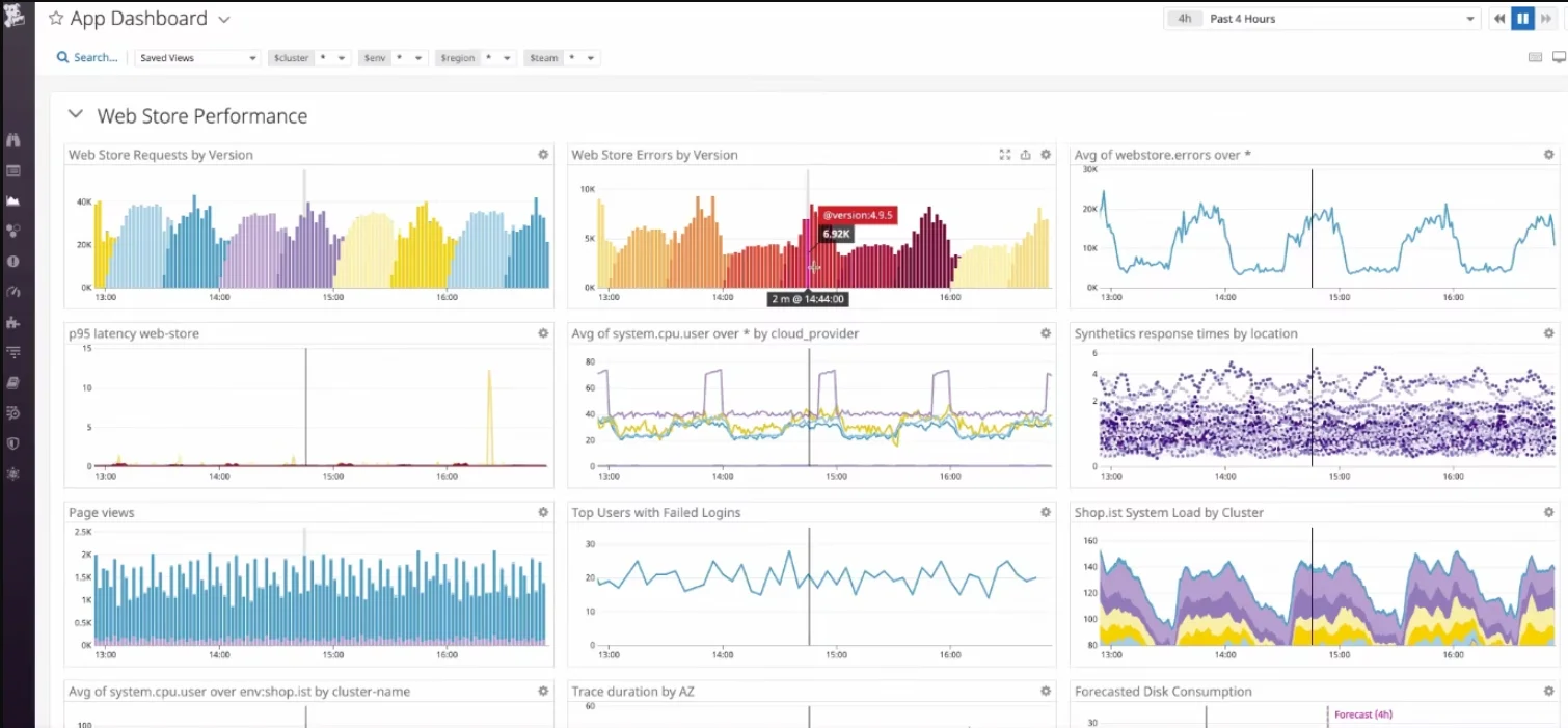
Compared to the other products on this list, Datadog is a more no-nonsense and serious dashboard BI solution. It doesn’t have a long list of fancy widgets or controls. Instead, it focuses on conventional hard graphs and charts. Organizations that specialize in software development and distribution will most likely benefit from Datadog the most. Its primary focus is on tracking faults and failures. Databox core features include:
- Alarms and notifications
- Incident management
- Database monitoring
- CI visibility
- Network monitoring
- Real-time user monitoring
While Datadog isn’t the most feature-rich dashboard BI solution, it has some of the most flexible and affordable pricing. It’s one of the few BI solutions that offers a free plan that supports up to 5 hosts.
In any case you decide Datadog isn’t right for you, here are some of the best Datadog alternatives to consider.
21. Zoho Analytics
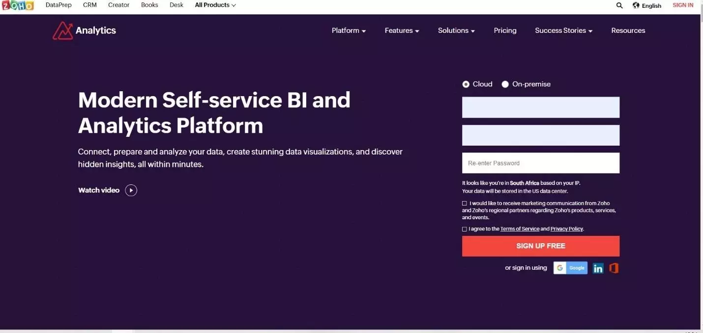
Zoho Analytics is a cloud-based BI solution for dashboards and reporting. You can analyze and view data from multiple sources including cloud drives, locally stored files, databases, and business applications. Like most of Zoho’s products, Zoho’s Analytics dashboard uses a simple but engaging flat design.
It gives you access to various widgets, charts, and graphs to display all your important data in real-time. Dashboards can be easily built and customized through Zoho Analytics’s drag and drop interface.
22. Monday.com
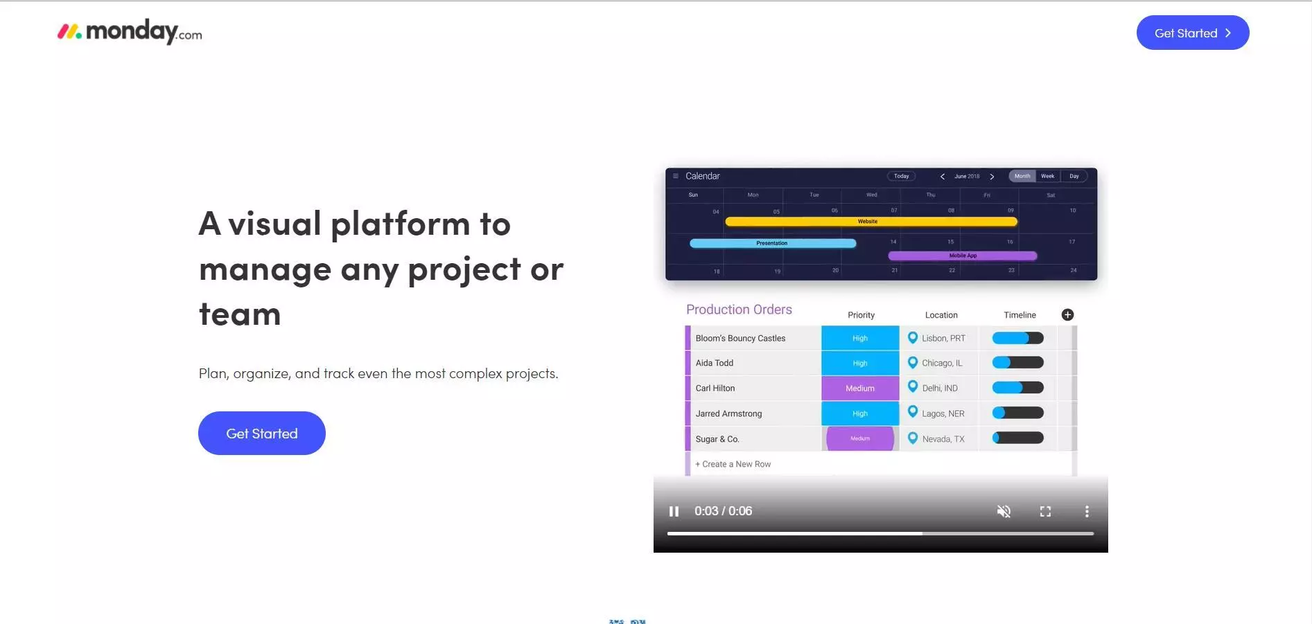
Monday is more of a project management tool with integrated elements of BI. It allows you to create dynamic dashboards that visualize your company’s monthly production information as well as q2 production.
Each user can also create their own personal dashboard that keeps them up to date with the progress of projects, collaborations, personal and company-wide information.
Monday isn’t as all-enveloping as the other tools in this section. However, if you’re looking for a lightweight dashboard application to help you run your business, then look no further than Monday.
23. Corporater Business Management Platform
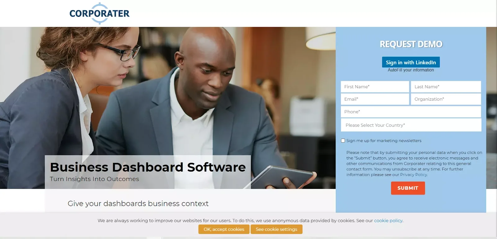
Corporater Business Management Platform is a BI solution that primarily specializes in integrated software solutions. Its business dashboard solution allows organizations to construct advanced dashboards that visualize all business framework data. Corporater has a very professional and sterile look-and-feel in its UI presentation.
This is perfect for companies looking for an efficient no-nonsense dashboard application that isn’t overblown with unnecessary controls and widgets. However, dashboards built with Corporator are beautifully responsive, clean, and simple.
Predictive Analytics
In theory, by comparing the present and the past, we can predict the future. Essentially, this is the premise of predictive analytics. These techniques involve using a large pool of data to forecast future outcomes under a specific set of rules and conditions.
We can use them to determine how seasonal changes might affect customer behavior and attitudes towards products your business sells. And the following BI tools may help you here.
24. IBM SPSS Statistics
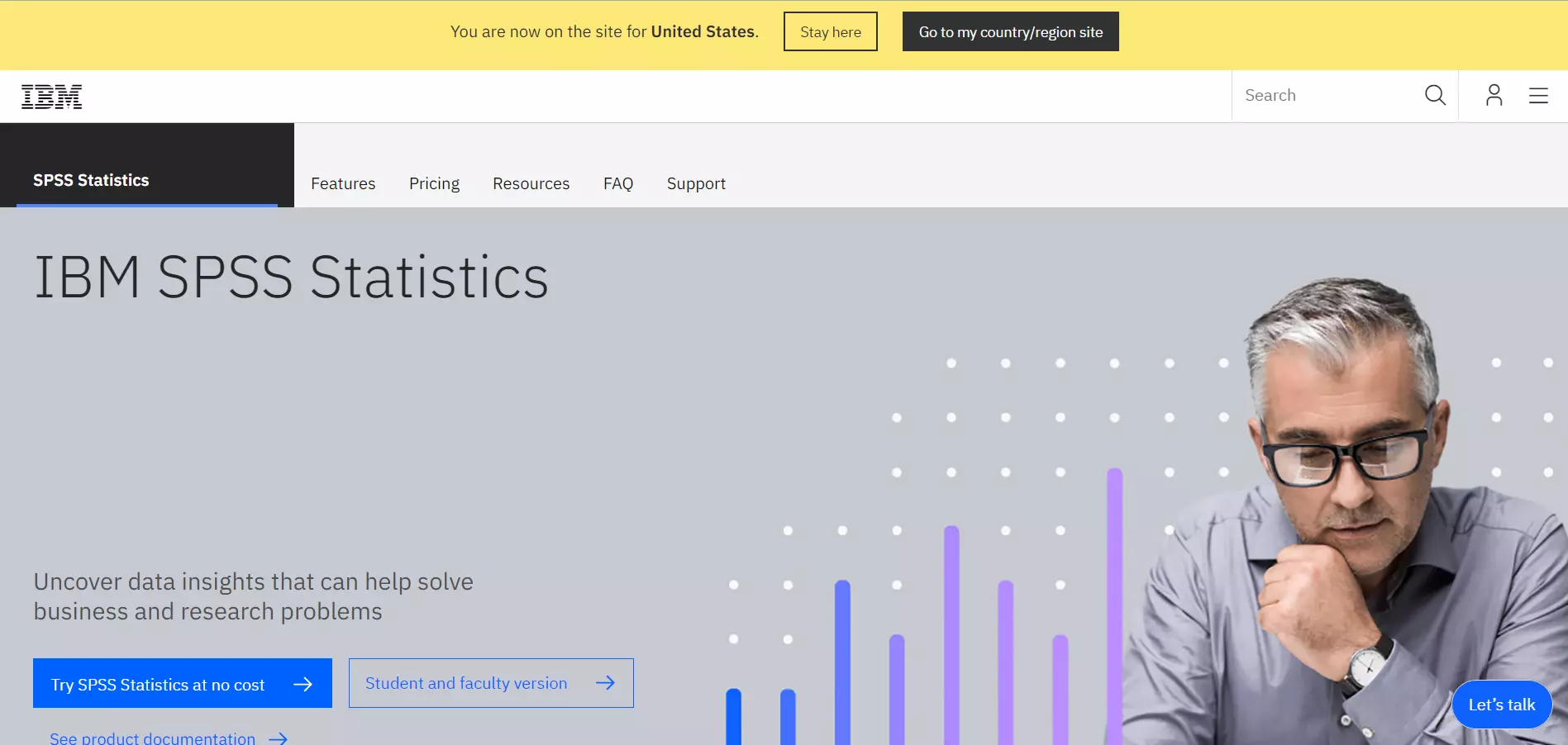
IBM SPSS Statistics is an advanced data analytics tool. What makes it so popular is its simplicity. Most users require very little experience with data analytics to understand and use IBM SPSS Statistics.
Nevertheless, IBM SPSS statistics offers 24/7 user support to further reduce the learning curve. Another area where this solution overshadows the other entries in this guide is its flexible deployment and variety of affordable options.
While other solutions may only offer integration with their own proprietary software, IBM SPSS Statistics offers open-source integration with programming environments like Python or R. Furthermore, IBM SPSS has access to over 130 plugins and extensions for statistical algorithms. It’s a very accessible service, not just for businesses but for individuals trying to learn more about data science.
25. TIBCO Statistica
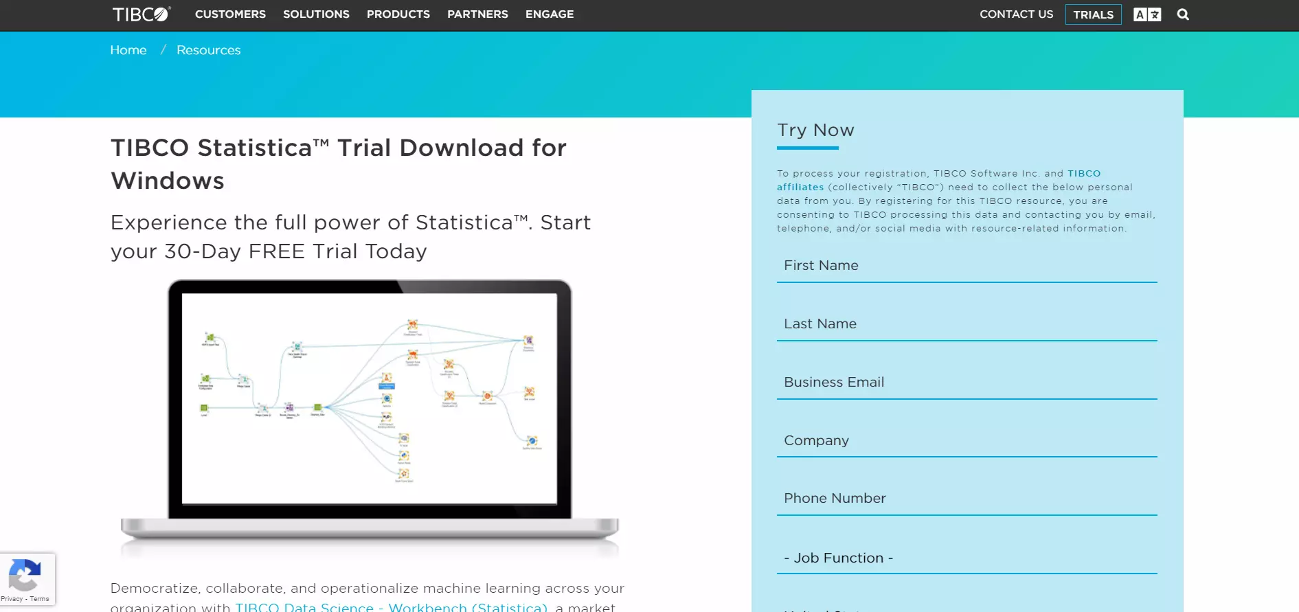
TIBCO Statistica is a data analysis tool that allows you to use AI-driven algorithms to refine your business’s workflow. In addition to its many advanced data analysis features, users can construct their analytics and visualize data through reports and dashboards.
Where TIBCO may fall flat is in its usability. Its user interface is quite complex and requires a bit of time to master. Its report building section is a bit clunky too.
Unlike most of the tools in this guide, it comes as a desktop application. Thus, it requires on-premises installation. This can either be seen as an advantage or disadvantage. Nevertheless, TIBCO Statistica is a great system for predictive analytics.
26. H2O.ai
H2O.AI is an open-source AI and machine learning platform made for enterprises. Even start-up companies who may not be able to afford advanced predictive analytic software should have options right? This is where H20.AI comes in.
H2O.AI offers a deep neural network and a multilayer perceptron in addition to a large collection of machine learning algorithms. It’s a flexible service that can be used to produce business models. While it takes some time to set up for business’s predictive analysis requirements, it’s free.
27. Emcien
Emcien is a highly reputable predictive analytics solution that is primarily used for web app integration. They primarily cater to large organizations and agencies. Because Emcien is cloud-based, it intrinsically features multi-platform support. However, it also features dedicated applications for Android, Windows, and Mac.
28. Alteryx
Alteryx offers a wide variety of BI essentials. It allows you to take your pool of data and parse, blend, and distill it. Additionally, Alteryx also features reporting tools to help you visualize and share your data. With Alteryx, you can automate the entire analytic process. Most predictive analytic tools can be overwhelming.
Alteryx uses a flat design for its user interface. Alteryx does have a few limitations. For instance, it comes in the form of a desktop application that only supports Windows operating systems.
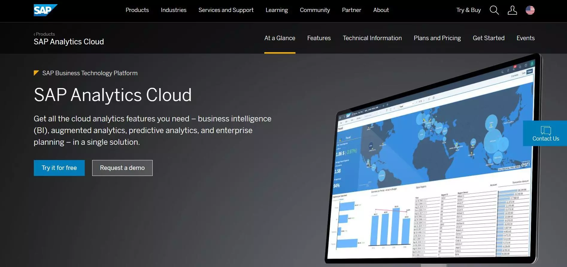
29. SAP Analytics Cloud
SAP Analytics Cloud is the second SAP tool to make an appearance on this list. It’s an all-in-one analytics solution that uses machine learning to help enterprises create sustainable roadmaps for their products. In addition to its predictive analytic features, it also comes with:
- Dashboarding
- Reporting
- Data-discovery
- Visualization
SAP Analytics Cloud has full Microsoft integration along with embedded analytics that allows users to construct what-if scenarios in real-time.
Data Warehousing Tools For BI
Data warehouses are central data repositories that consolidate data from multiple sources, especially semi-structured and structured data. Data flows into a data warehouse from transactional systems, relational databases, and other sources, typically in large volumes and regularly.
Usually, a data warehouse stores data for analytics and includes ELT, relational database, data mining, statistical analysis, and reporting capabilities to support this quest. Here arfe solid examples you can consider.
30. Snowflake
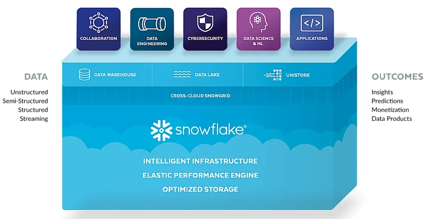
Snowflake is a fully managed, cloud-based platform designed for data storage, processing, and analytics. It is built on top of Google Cloud, Microsoft Azure, and Amazon Web Services, making it a versatile solution that supports multi-cloud environments.
Snowflake acts as a Software-as-a-Service (SaaS) data cloud platform, meaning you can set up separate data marts, data lakes, or external data warehouses while enabling secure data sharing capabilities. It offers features like separation of storage and compute and scalable compute resources that respond to workload fluctuations within seconds.
Better yet, Snowflake pricing is consumption-based, meaning you pay for only what you use.
Snowflake’s architecture involves three core layers:
- The Data Storage Layer for managing data storage processes
- The Query Processing (Compute) Layer for analyzing data using virtual cloud data warehouses, and
- Cloud Services that handle infrastructure management, security, and encryption.
Learn more about the Snowflake architecture vs AWS vs Azure in our guide here.
31. Amazon Redshift
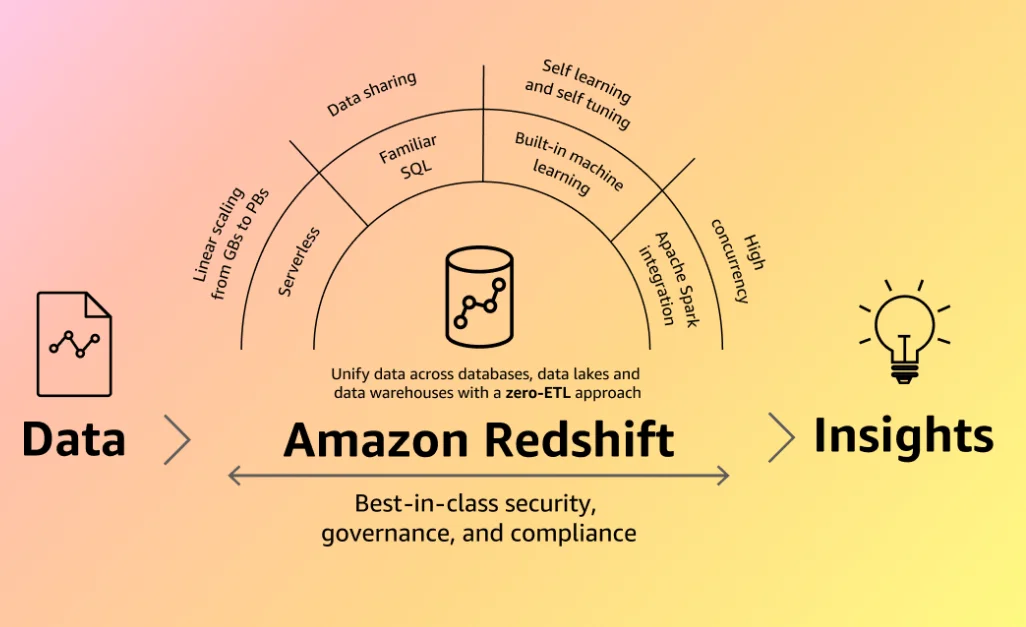
Like Snowflake, Redshift is fully managed, AI-powered, and can handle large datasets reliably. However, Redshift uses a Massively Parallel Processing architecture vs Snowflake’s separated compute and storage design. Learn more about the differences between Snowflake vs Redshift here.
Redshift also has a zero-ETL approach to data warehousing, supports near-real-time use cases, and is great at enabling collaboration, AI/ML applications, and a string of third-party integrations.
The cloud data warehouse is particularly a favorite for organizations that want a solution that’ll handle petabytes of datasets rapidly and relatively affordably. See our guide to learn about how Redshift works here.
Better yet, check out our guide for how Redshift pricing works here.
32. Databricks Lakehouse
What makes Databricks unique is its ability to combine and offer the capabilities of data warehouses and data lakes within a single platform (thus Databricks “Lakehouse”). This architectural design enables data scientists, analysts, and data engineers to work together to surface insights from structured, semi-structured, and unstructured data.
It is also built on top of Apache Spark’s open-source and distributed platform. This is great because it enables using Databricks as a first-party service on top of AWS, Azure, and Google’s GCP.
Databricks offers a secure cluster-computing environment. It also offers automated cluster scaling for optimal resource utilization and accessible visualizations through libraries like Matplotlib and Plotly.
The lakehouse also emphasizes collaboration, scalability, and ease of use. It supports this through tools such as Notebooks for documentation and code creation, Jobs for scheduling tasks, and solid monitoring capabilities.
Data Cleansing
Not all data is important. In fact, bad data often poisons good data. This can obstruct your attempts to extract timely analytical information from good data. The key to eliminating redundant and incorrect records is to have a robust data cleansing tool in your BI stack. Here are several examples.
33. Tibco Clarity
Because of its simplicity, Tibco Clarity is one of the best data preparation solutions on the market. It’s completely cloud-based, so it’s accessible from nearly any internet-enabled modern computing device.
You can gather and edit data from disparate sources. Clarity allows you to manage duplicates and ensure data integrity. While its user interface is intuitive, some of its more complex configurations will take some training and practice to grasp.
Most users may find the rule logic a little hard to grasp at first. However, you’ve mastered the technicalities, you should be able to automate your organization’s entire data cleansing procedure.
34. Xplenty
Xplenty is an all-in-one cloud-based data integration platform presented through a simple user interface application. The application is divided into three core parts:
- Sources
- Transformations
- Destination
Sources allow you to define where your data lives i.e., cloud storage or local databases. Transformations allow you to dictate what happens to your data i.e., cleansing. Destinations allow you to define where your data goes after the transformation process.
Xplenty guides you through the entire process with their wonderfully organized application. The entire process involves little to no coding thanks to Xplenty’s drag and drop interface. Xplenty is the perfect BI tool for users who are looking for simple and fast data cleansing.
35. RingLead Cleanse
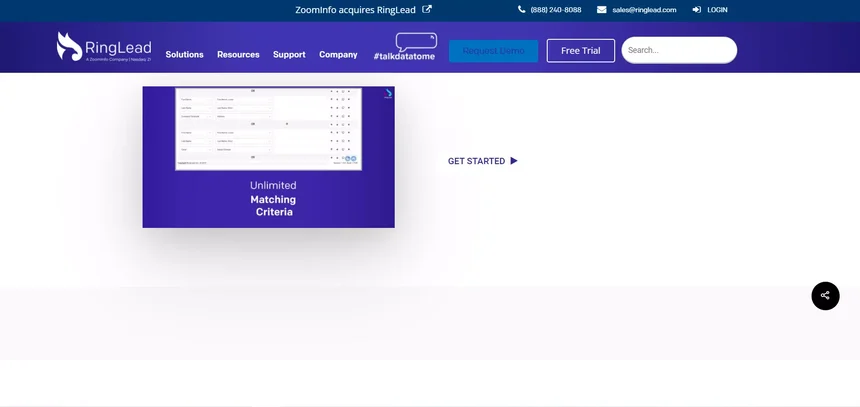
Ringlead Cleanse is a cloud-based data cleansing solution that focuses heavily on eliminating duplicate data and other unusable records from B2B databases. It can help you optimize missing, unstandardized, and inaccurate data.
Ringlead Cleanse can automate your data cleaning and update tasks. It can be integrated with your salesforce and marketing automation platform to decrease the number of unusable records in your data pool. Ringlead Cleanse’s user interface isn’t as fancy as Xplenty’s.
However, it still offers a wizard to help guide you through the integration and data cleansing process.
36. Informatica Cloud Data Quality
Informatica Cloud Data Quality is an enterprise-level data quality assurance tool. It’s a more complex alternative to drag-and-drop-driven data cleansing tools like Xplenty. Informatica cloud data quality caters more to power users. It supports both cloud and on-premise data sources. Some of Informatica Cloud Data Quality’s most notable features include:
- Iterative data analysis
- Reusable data discovery and cleansing rules
- Seamless integration with Apache Spark
- Real-time data monitoring and notifications
- AI-driven insights
If you’re looking for a data cleansing tool that allows you to control how your data is transformed, then we highly recommend Informatica Cloud Data Quality.
37. Oracle Enterprise Data Quality
Once again, another Oracle product makes an appearance on our list. This time, it’s Oracle Enterprise Data Quality, Oracle’s data extraction, transformation, and loading (ETL) solution. It is well-suited to companies that manage large sets of data daily.
Organizations can utilize it to parse through multiple data sources and eliminate duplicates and correct errant records. It also features templates, pre-built processes, data visualization tools, and a quick-stats overview that helps you understand and cohere the data circulating in and around your business.
38. SAS Data Quality
SAS Data Quality is a data validation tool for enterprises. In addition to its ETL and data cleansing capabilities, SAS Data Quality can assist companies with data model governance.
If your business runs complex prediction models, you can use SAS Data quality to monitor real-time data and fix any errors it encounters. This can make your predictive analytics more accurate. In fact, you can include it in your SAS package and run it alongside SAS Advanced Analytics.
39. IBM InfoSphere Quality Stage
IBM InfoSphere Quality Stage is a flexible enterprise data validation solution. Companies can choose to deploy it as an on-premise desktop application or a cloud-based application that can be accessed through a web portal. It features intense data profiling that can help you understand how your records relate to each other as well as identify which records are corrupt or missing.
Data Discovery
Data discovery is a key facet of data science and business intelligence. Basically, it describes the process of acquiring new sources and streams of data. A good data discovery and exploration tool can help you get the type of data you need to make better business decisions, faster. This section shares some of these BI platforms.
40. Looker
Looker is a data discovery and analysis platform that’s driven to make data exploration more accessible to non-data professionals. It uses rapid deployment and is compatible with almost any analytic database.
As a young company, Looker endeavors to make it easy to define your data and identify worthwhile business metrics that your entire company can access and rely on.
In addition to its data discovery capabilities, Looker also allows you to build dashboards, construct workflows and embed some of its analytic tools in your software products.
41. Hexomatic
Hexomatic is another data discovery platform built to uncomplicate business intelligence. It allows you to pull data from almost any website and use it to draw insights.
Hexomatic offers over 60 different ready-made automations to help you build a data scraping routine. It’s completely cloud-based and customization can be done through simple point-and-click instructions.
42. Qlik Sense
Qlik Sense is a data discovery and analytics software solution that is built on an associative engine. Qlik Sense eliminates unnecessary coding. It uses its AI to identify which data is relevant to your business and then constructs associations accordingly.
It uses color-coding to help distinguish between data that is relevant or irrelevant to your business. Again, it’s a cloud-based solution so it can be accessed and configured from any computing device.
43. Wolfram Mathematica Software
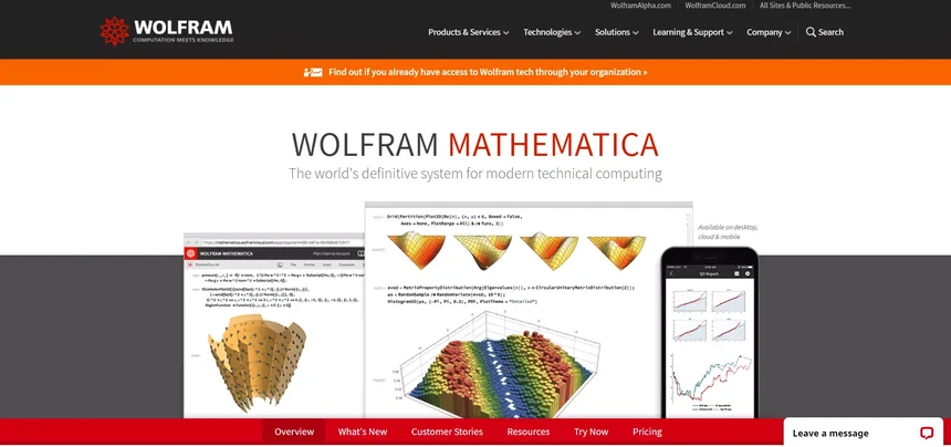
Wolfram Mathematica is a little different from the other tools in this section. It’s a general system for computation that you can use for BI and data discovery applications. It has flexible deployment options. It can be deployed on the cloud or as an on-premise solution.
The biggest downside of Mathematica is the high learning curve. It takes effort and time to set up. But if your company is looking for a tool that allows you to dictate how your data is discovered and analyzed down to every minute detail, then this service might be for you.
44. Sinequa Software
Sinequa is an enterprise data search engine that allows all your company’s employees to access crucial business intelligence. It uses over 200 connectors and built-in converters to index all your organization’s data.
The platform uses AI to transform all your abstract data into relevant information and actionable insights. In addition to this, Sinequa uses natural language processing to enrich and cleanse your data. Its beautifully crafted and well-organized user interface helps employees understand your data as frictionlessly as possible.
45. Mozart Data
Mozart Data is an extremely lightweight BI solution that helps you discover and manage your data. It has over 140+ connectors which allow you to index and pool data from a wide net of sources.
However, you’re not limited to the connectors Mozart has on offer. You can use the service to create your very own. Mozart also has ETL capabilities. You can schedule and dictate how your data is extracted and transformed from its simple user interface.
46. Acterys Software
Acterys is a dynamic and extended planning analytical platform. It allows you to forgo the long and costly integration of data sources. It completely automates their entire integration process, so you can scrape and discover data as quickly as possible.
It achieves this through end-to-end apps that give you access to everything from complex data loading to interactive pre-made dashboards. Acterys also features integration with other proven BI platforms such as Microsoft BI and Excel.
Observability Platforms for Business Intelligence
As opposed to monitoring, observability is geared towards predicting and solving problems before they arise. Traditional monitoring is reactive rather than proactive. By using the tools in this section, organizations can track and analyze real-time operational data, organize it in a way that suits relevant teams, and take proactive measures to prevent disruptions, performance degradation, and unexpected costs.
47. AppDynamics
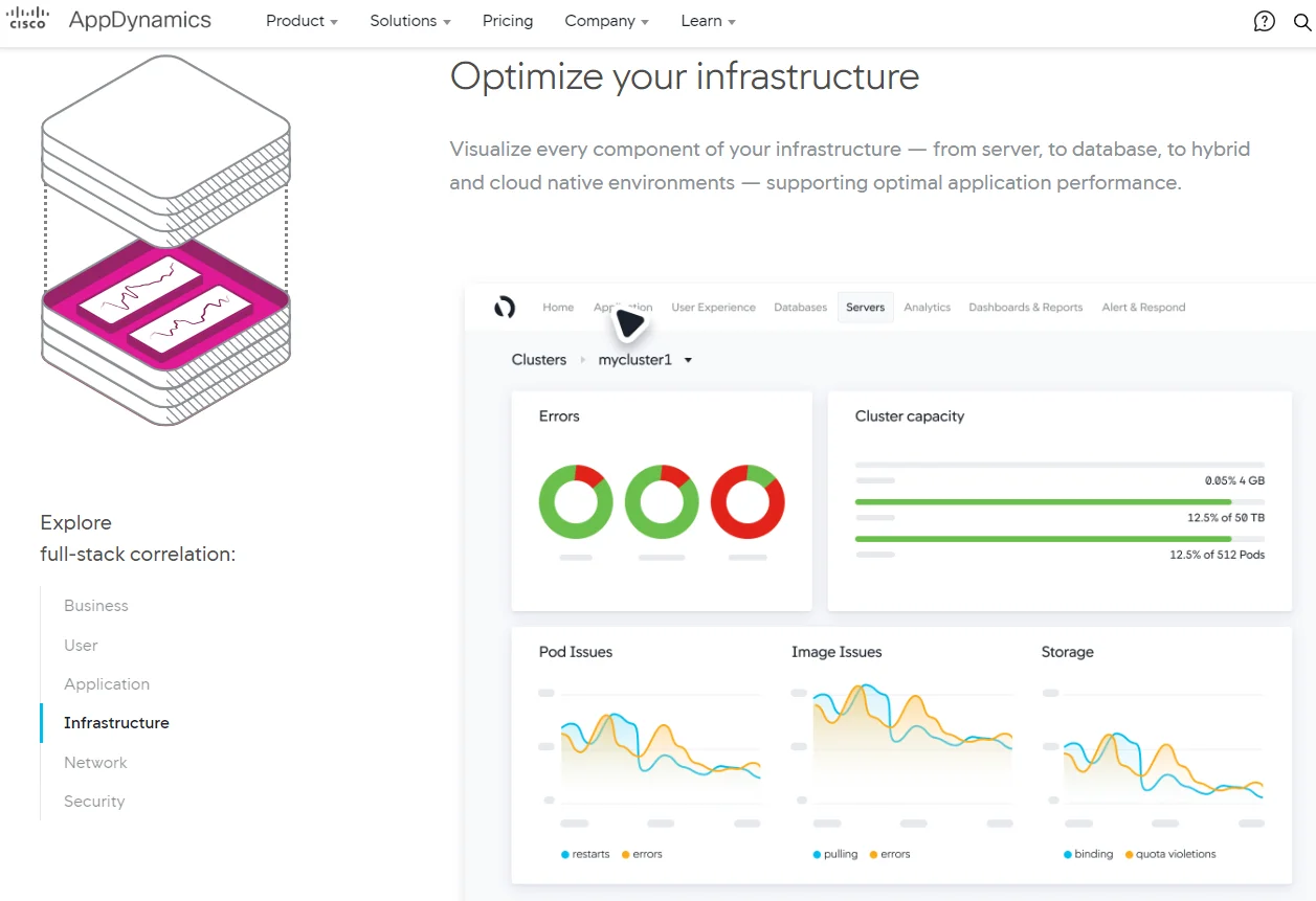
AppDynamics provides a comprehensive observability platform. It is best known for its application performance management (APM) offering. However, AppDynamics also delivers robust infrastructure, network, user experience, and security monitoring.
In terms of business intelligence, AppDynamics helps you correlate infrastructure and app performance with business metrics you care about. This can help you identify issues such as buggy code, slow networks, and security vulonerabilities that can compromise user experiences.
You can also use it to track your customers’ journeys and experiences across multiple points of contact to tell what you can improve to ease their experience and encourage conversions and returns.
48. New Relic
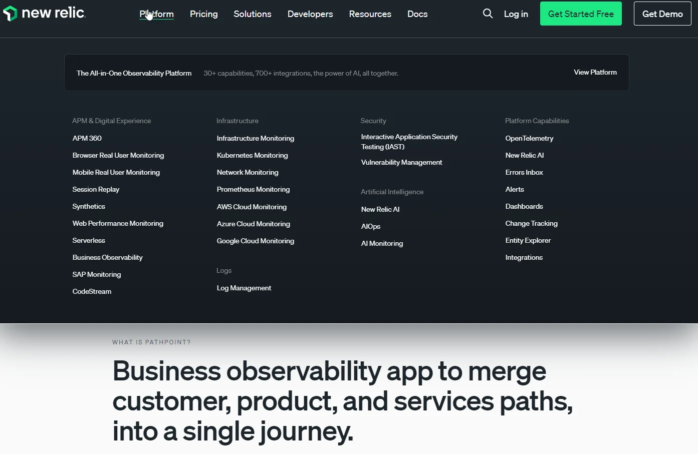
New Relic is a robust, full-stack observability platform. It is particularly capable for monitoring, analytics, and all-out business intelligence needs of companies with large, multi-cloud environments and workloads.
New Relic actively connects IT data with business outcomes, from real user and website performance monitoring to observing customer journeys, process flows, and touchpoint activity. It also supports custom data reporting and custom UI visualizations to tailor insights to specific business needs.
The platform’s integration with incident management tools, machine learning-driven anomaly detection, and root cause analysis capabilities further amplify its utility for businesses seeking comprehensive observability and actionable insights from their data.
49. Sematext
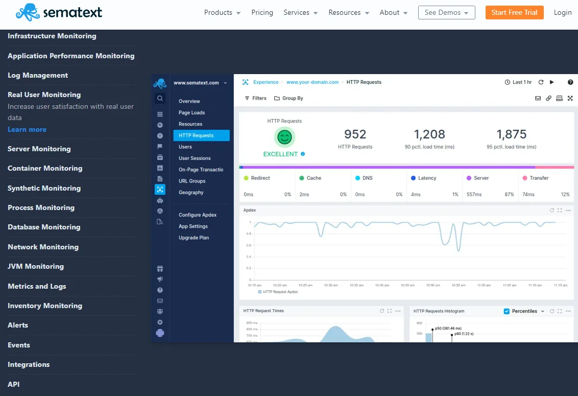
Like New Relic and AppDynamics, Sematext is a full-stack observability solution capable of enterprise-level applications. But it offers a more affordable alternative to New Relic, AppDynamics, Splunk, Sumo Logic, and others.
Better yet, Sematext’s out-of-the-box dashboards and visual components are tailored for each integration, optimizing user experience and data analysis. The platform also excels at real user monitoring (RUM) through the Sematext Experience. This enables you to track website performance metrics and map them to key business metrics. This helps you tell the effects of IT on your business — and how to fix that.
Additionally, Sematext offers synthetic monitoring tools that track APIs and websites globally. This provides insights into critical metrics like website speed and error rates.
Check out our morfe in-depth guide to the best observability tools here.
Automation Platforms for BI
Automation platforms can play a significant role in supporting business intelligence use cases by streamlining workflows, integrating various applications, and automating data processes. Here are two you’ll want to check out.
50. Zapier
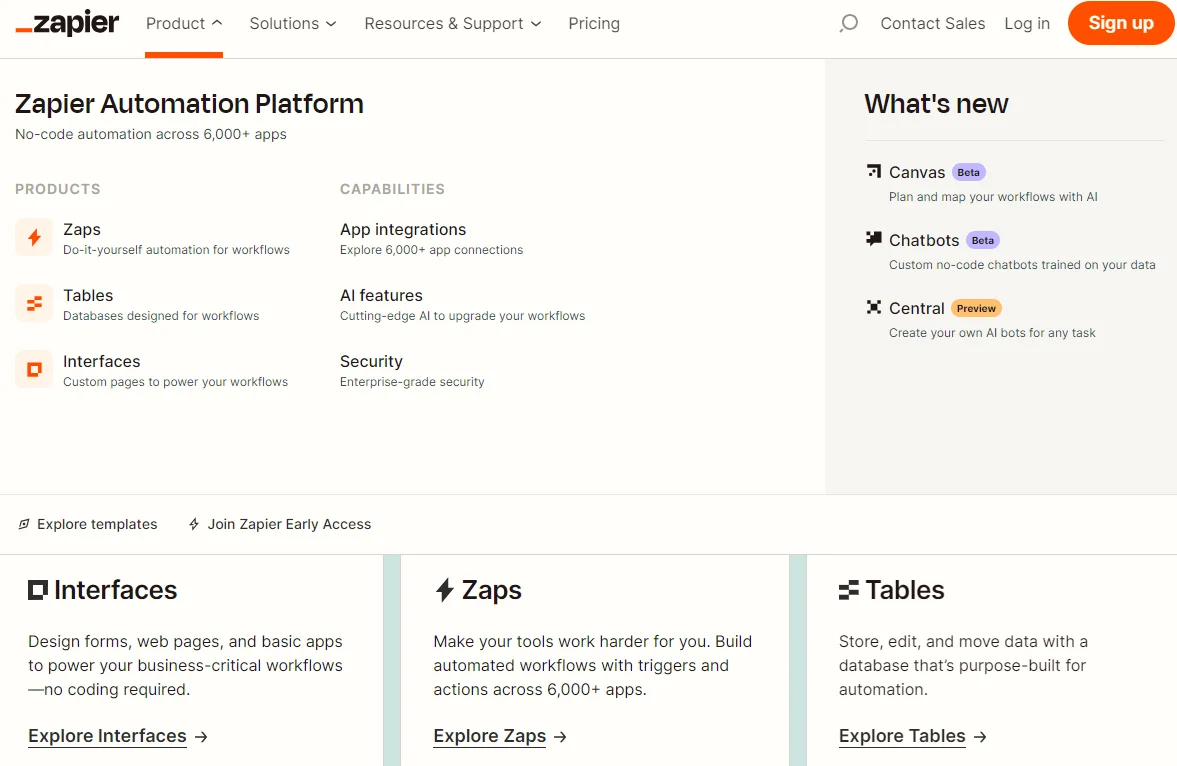
Zapier is not a Business Intelligence (BI) tool in the traditional sense. It doesn’t provide BI functionalities like data analysis, reporting, or data visualization. Instead, it can help your business streamline workflows by connecting different apps and services – with minimal coding.
Zapier enables teams to create automated actions, known as “Zaps,” which trigger specific processes across different web applications. For example, a Zap might automatically save email attachments from Gmail to Dropbox or add new event attendees from Eventbrite to a Mailchimp list.
By automating data flow between applications, Zapier can ensure that your other BI tools use up-to-date and comprehensive data. And this is great for leveraging accurate, timely insights for decision-making.
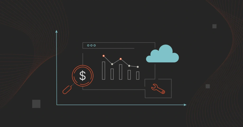
What Next: Protect Your Margins With Smarter Cloud Cost Intelligence
Traditionally, cost tools focus on totals and averages. They also require perfect tags for cloud costs calculations, and barely allocate 100% of your spend. CloudZero is different.
With CloudZero, you get immediately actionable cloud cost intelligence, such as Cost per Customer.
This helps you pinpoint how much you spend to support a specific customer. With this knowledge, you can tell how to set your pricing for that customer to both encourage renewals and protect your margins for each contract.
Only CloudZero provides this level of granularity across all cost views. We also allocate 100% of your spend to minimize cost blindspots. Better yet, CloudZero’s hourly reports (instead of once a day), real-time cost anomaly detection, and contextual alerts ensure you catch overspending issues before they happen.
Ambitious brands like Drift, Uplift, and Remitly use CloudZero to understand their cloud spend. They’ve reduced costs by $2.4 million, 40%, and Remitly was able to allocate 50% more costs without tagging, respectively. Want similar results or better?  and experience CloudZero hands on.