Like most SaaS companies, CloudZero uses its own product. When we released cost per customer reporting, we tested it on ourselves first.
And today, we use cost per customer reports regularly. Why?
Because they help leadership answer board and renewal questions, including customer-level margins.
Cost per customer is valuable and hard to get right.
Multi-tenant systems and Kubernetes can hide the link between shared infrastructure (like EC2) and the customers using it.
Most teams end up in spreadsheets and best guesses.
In this guide, I’ll walk through how cost per customer model works, the metrics we care about, and what surprised us along the way.
Why Cost Per Customer Data?
Cost per customer answers a critical question for SaaS teams: Which customers are profitable and why? Customer profitability analysis is the foundation of any sustainable SaaS pricing and growth strategy.
In SaaS, revenue is predictable. Costs are not.
Two customers on the same plan can drive very different infrastructure usage.
Data volume, feature combinations, query patterns, and usage frequency all affect the cost of serving them.
Without the cost per customer, teams guess. And that guesswork leads to margin surprises, mispriced contracts, and slow reactions to cost spikes.
For us, cost per customer is not just about savings. It’s about decision quality.
We use it to:
- Understand the margin by customer segment
- Support pricing and renewal conversations
- Validate whether growth improves or erodes unit economics — a core concern in SaaS unit economics analysis
For example, if mid-market customers generate higher margins than enterprise customers, leadership can pair that insight with CAC and sales motion data. That directly informs where we invest our go-to-market effort, including how we approach cloud cost optimization.
Cost per customer matters because it connects cloud spend to real business outcomes, not just invoices.
playbook
The AI Cost Optimization Playbook
Traditional cloud cost management is broken. Here’s why — and how to make the switch to cloud cost intelligence.
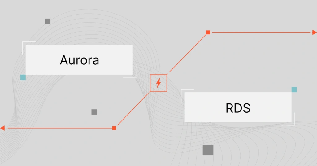
How It Works
Calculating cost per customer accurately requires more than billing data. Most cloud cost management tools stop at invoices. CloudZero functions as an observability system, ingesting AWS Cost and Usage Reports (CUR) plus rich metadata from your environment to explain why costs occur, not just where they appear.
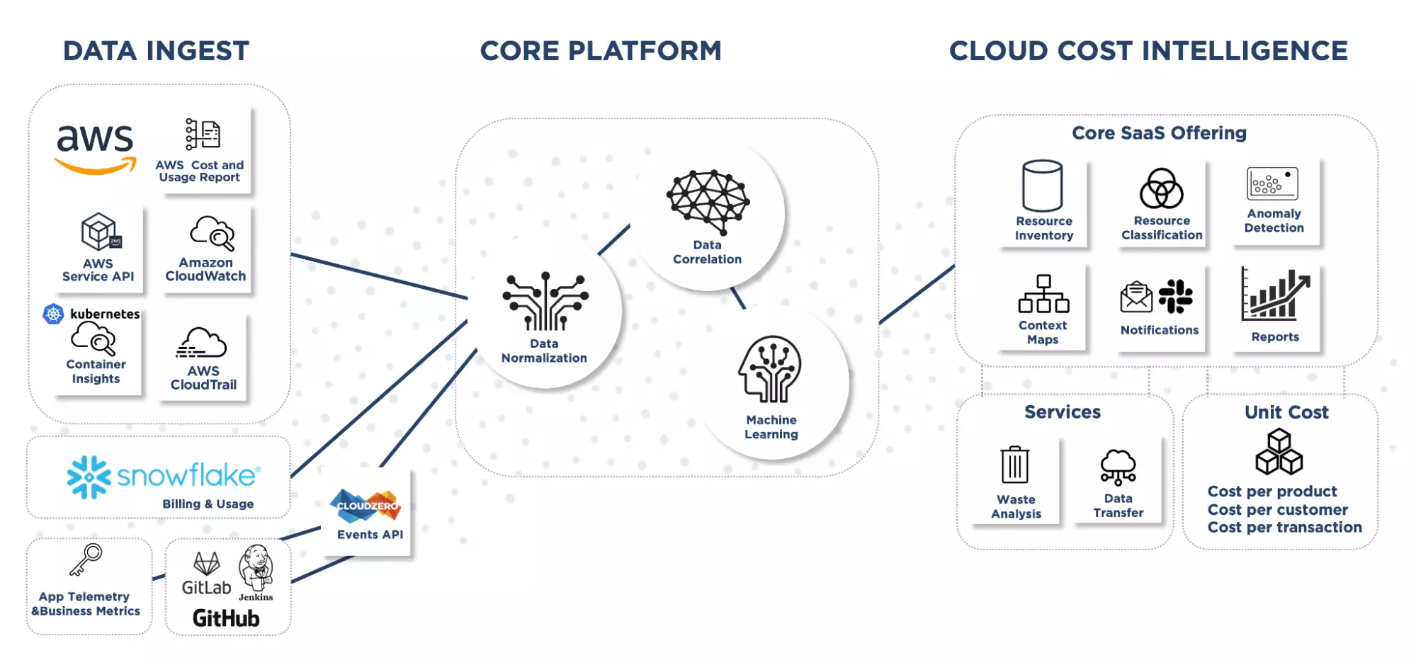
That includes:
- Cloud service metadata
- Resource relationships
- Kubernetes context
- Deployment and runtime signals
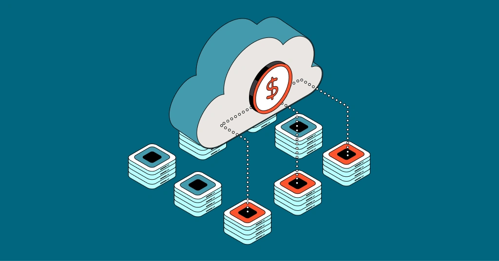
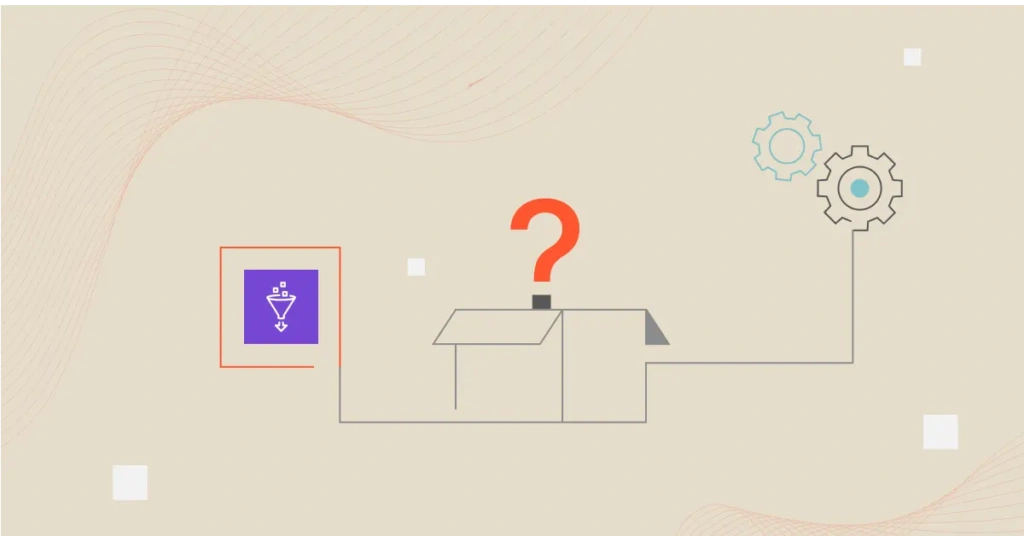
This extra context is what makes cost per customer possible at scale. Here’s a simple diagram to visualize how we think about it, which I’ll explain in more detail next.
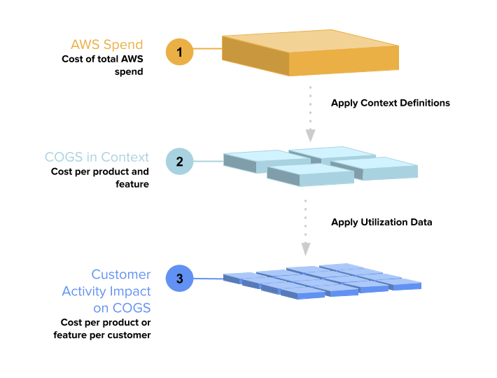
To do that, we apply two layers of context to raw cloud spend.
Layer 1: COGS in context
The first step is to organize cloud costs into Cost of Goods Sold (COGS) in a way that aligns with how your business operates.
Instead of relying solely on tags, CloudZero uses context definitions, logical rules that group costs based on how resources behave and relate to one another.
These definitions can be used:
- Tags (when they exist)
- Cloud service metadata
- Kubernetes clusters, namespaces, and workloads
- Accounts, regions, environments, and teams
Context definitions are written in a simple YAML-based domain-specific language. That makes them flexible, version-controlled, and easy to change as your architecture evolves.
During onboarding, a CloudZero cost expert helps define these mappings. Most teams reach usable COGS context in one to two hours, not weeks.
Once applied, you can view costs by:
- Product
- Feature
- Environment (prod vs R&D)
- Team
- Region
This is how we separate infrastructure spend from business cost.
Useful resources:
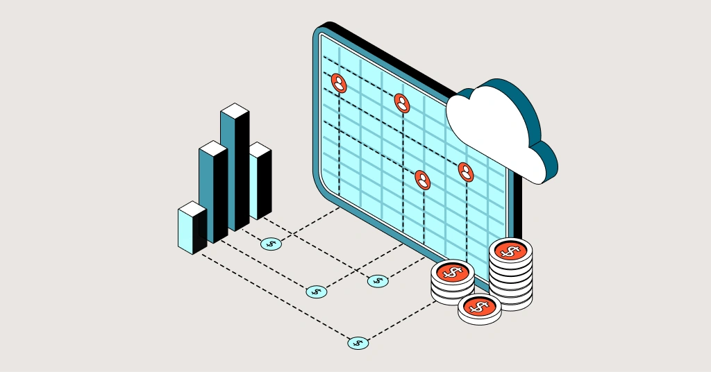
Layer 2: Customer Activity Impact on COGS
Once costs are allocated to COGS, the next step is to assign them to customer usage.
This is where cost per customer becomes precise.
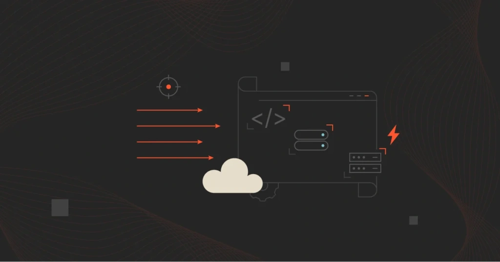
Here’s a marketecture diagram of what the process looks like:
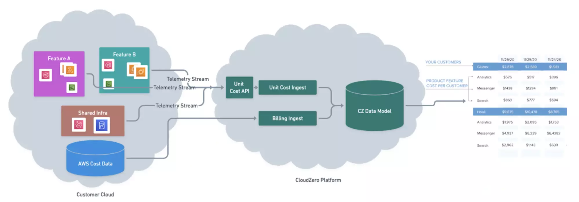
CloudZero ingests telemetry streams from your application. These streams describe how customers use your product, not revenue, but usage signals that drive costs.
A telemetry record might show:
- Which customer used a feature
- How much of that feature did they use
- When the usage occurred
These records are sent to CloudZero through a simple API.
We normalize telemetry over time (hourly or daily) and join it with COGS data from Layer 1. Then we allocate the cost proportionally.
Example logic:
- Feature A costs $10,000 per day
- Customer X accounts for 1% of Feature A usage
- Customer X is allocated $100 of cost for that day
That logic scales automatically across millions of records. No spreadsheets. No estimates.
This approach avoids the biggest failures of cost per customer projects:
- Tags breaking when resources change
- Shared infrastructure hiding real usage
- Kubernetes abstraction masking who caused what
Instead, CloudZero ties cloud spend to how your product is actually used.
That’s why the output isn’t just a number. It’s an explanation.
CloudZero Cost Per Customer Report
Here’s what cost per customer reporting looks like in production:
We use CloudZero’s built-in Cost Per Customer report to track both the average cost per customer and the cost for each customer, with a clean breakdown by product feature.
Some teams also pipe this data into a BI tool to pair cost with revenue and margin. But for most teams, the report is the fastest way to answer leadership questions without first building a custom model.
Average cost per customer
This is the “are we scaling efficiently?” view.

As we onboard customers, total spend rising isn’t automatically bad. What matters is if cost per customer is flattening or falling as usage grows. That’s how you spot economies of scale early instead of discovering margin pain at renewal time.
Customer-by-customer cost (treemap + drill-down)
Next, we look at the distribution.
The treemap makes it obvious when one customer is costly. And when you click into that customer, you can see which product areas are driving their cost. That’s what turns cost per customer from a finance metric into an engineering action list.
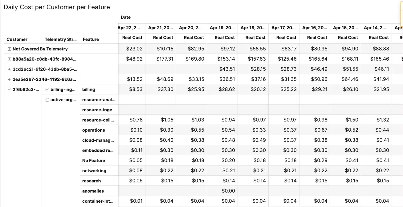
Daily cost per customer per feature (exportable)
This is where utilization context pays off.
CloudZero’s approach combines billing data with telemetry streams to enable you to allocate shared, multi-tenant costs based on real usage signals. That’s how you move beyond averages and get a precise cost per customer when infrastructure is shared.
You can export the daily table to perform deeper analysis in your BI layer, or use it to compare segments (SMB vs. enterprise) and identify “expensive behavior” patterns tied to how customers use specific features.
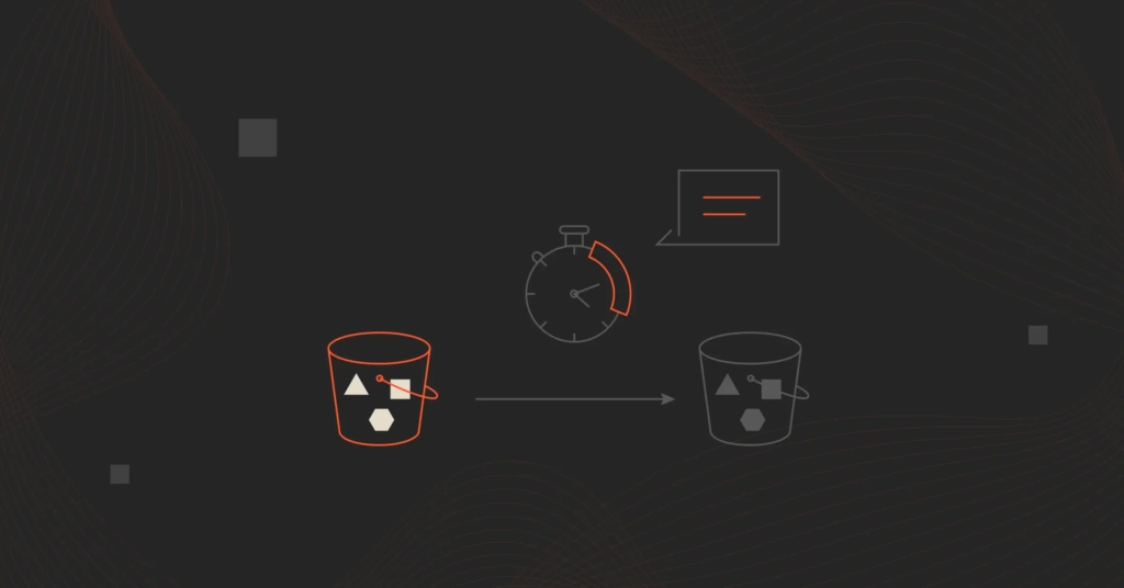
What we changed after a real spike
When we see a spike, we don’t want a mystery.
CloudZero pairs the report with real-time anomaly detection so spend events surface fast, without relying on manual thresholds.
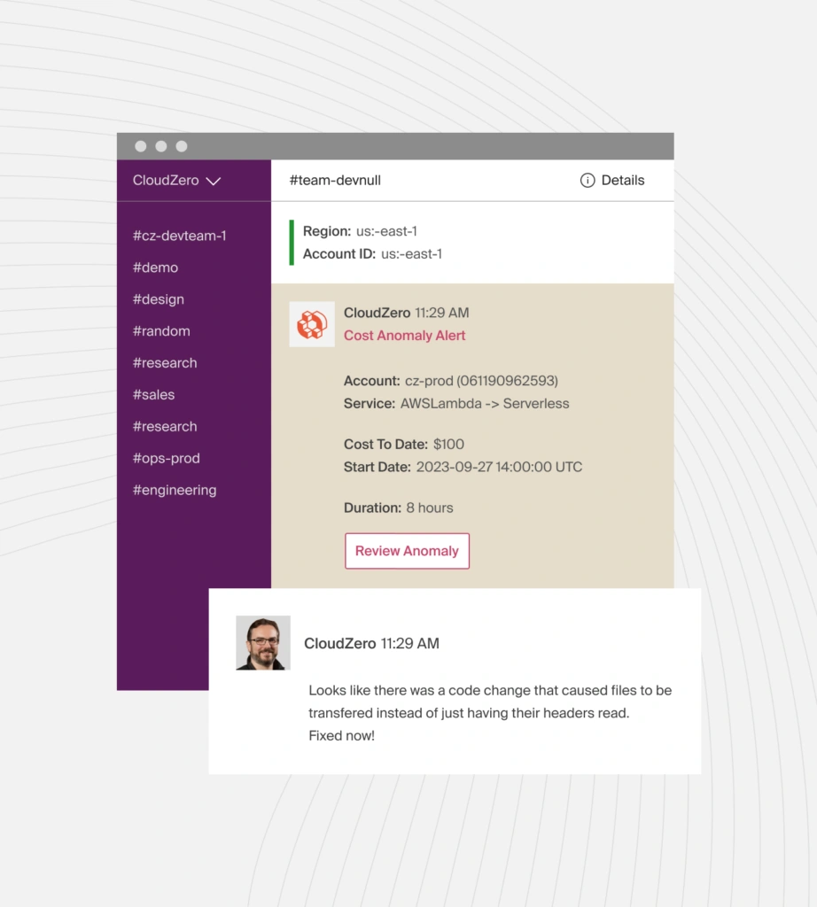
When a customer’s data profile changes (higher cardinality, higher ingest volume, different usage), we can quickly identify it, quantify the cost impact, and address the root cause while the change is still fresh.
Ambitious brands such as Grammarly, Duolingo, Toyota, Drift, UpStart, and more use CloudZero to protect their margins as they scale. Take a product tour or  to see how CloudZero can help your company do the same.
FAQs
What is the cost per customer in cloud computing?
Cost per customer measures how much cloud spend is needed to support each individual customer. It includes shared infrastructure, usage-driven services, and operational overhead, not just directly assigned resources.
Why is cost per customer difficult to measure in the cloud?
Cloud infrastructure is shared, elastic, and dynamic. Services such as Kubernetes, serverless, and managed databases make it difficult to map raw cloud usage directly to customers without context.
How does CloudZero calculate cost per customer? (Cost per customer formula)
CloudZero combines cloud billing data with customer usage telemetry. Costs are grouped into COGS and then allocated to customers based on the amount of each feature or service they use.
Does CloudZero need perfect tagging to work?
No. CloudZero does not rely only on tags. It uses context definitions derived from metadata, resource relationships, and Kubernetes signals, reducing reliance on manual tagging.
What data do I need to measure cost per customer with CloudZero?
You need cloud billing data and usage signals from your application. Usage signals describe how customers consume features that drive cost, such as data processed or jobs executed.
Can CloudZero measure cost per customer in multi-tenant architectures?
Yes. CloudZero is built for multi-tenant environments. It allocates shared infrastructure costs proportionally using customer usage data, even when customers share clusters or services.
How granular is CloudZero’s cost per customer reporting?
Costs can be analyzed daily or hourly and broken down by customer, product, feature, environment, or service. This helps teams detect margin issues early, not just at renewal.
How long does it take to set up the cost per customer in CloudZero?
Most teams see meaningful results within days. Initial COGS context setup usually takes one to two hours, followed by incremental onboarding of usage telemetry.
How is cost per customer different from cost allocation?
Cost allocation groups spend by teams or environments. Cost per customer assigns shared cloud costs based on each customer’s actual usage, enabling margin analysis and pricing decisions.
Is CloudZero only useful for large SaaS companies?
No. Any cloud-based business with shared infrastructure benefits from visibility into cost per customer, especially companies scaling usage, onboarding larger customers, or offering usage-based pricing.
What makes CloudZero different from traditional cloud cost tools?
Traditional tools focus on billing reports. CloudZero adds business context by connecting cost data to architecture, usage, deployments, and customers.
Can CloudZero integrate with BI or finance tools?
Yes. A lot of teams export CloudZero data into BI tools or combine it with revenue data to analyze margins, pricing, and profitability.
Is CloudZero a FinOps tool or an engineering tool?
CloudZero supports both. It gives finance accurate COGS and margin data while giving engineers actionable cost context tied to features and usage.